Visual Asset Strategic Tools. Capture Building Information for Building Life Management. Open Source/Low Cost Technology Solutions for you to control your buildings
Note- WordPress seems to be having issues (or maybe just me) with uploading some images. I’m not sure why as they are screenshots (and small) , but some images are missing in the article below. They are loaded into the WP Media library, but do not wish to be displayed. Apologies until I can rectify
I’m interested in maps and locations. I recently heard of the what3words as a method of finding locations where there were no postal street addresses and then started looking into the whole topic and found it quite fascinating. Google has PlusCodes. The idea of getting something delivered to you and also finding locations in areas
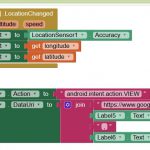
I lke GlideApps, they are cool. You can make some great apps with them. But you cannot access youtr phone’s sensors. So I thought, use App inventor to grab data from phone sensors, send it to google Sheets and then use GlideAppps to access the same google Sheets with that data to make a richer
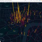
I saw this video on Kepler & React and was excited about the Kepler app. I want to try it with NZ covid data that I’m getting from some API endpoints. But its not structured in a GeoJson format. This is a tool that Uber have developed and shared, which is nice of them. I’m
Developing my covid map using API data pulled in in JSON format has caused me some grief. I have spent a couple of days with no progress at all trying to get variable data pushed through a function to use in a JS Template literal. In the end I had to wrap the whole thing
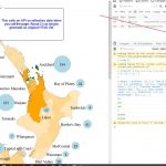
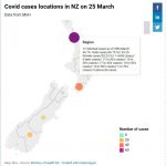
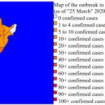
The Ministry of Health(MoH) have posted the original dataset on a different web page of each case and which District Health Board (DHB) they are under. The data can be found here. Instead of by region, its mapped to the District Health Board Regions. So the original map I was using in this post is
At the end of the fist part I’d got some data to play with from a couple of sources, cleaned it up, got some data to make paths to create a map and coloured map in by region based on covid cases. This was done using Excel, Notepad++ and displayed in browser. I was just
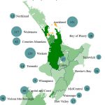
I’m thinking of trying to do an NZ map of regions where cases are. I’m using link to Wikipedia 2020 coronavirus pandemic in New Zealand page for data on region data. I have been looking for polylines for these regions and also centroids for region polylines. No luck so far with centroids but I got
I really enjoy the curated maps that Keir Clark presents on his Maps Mania website. I get them through my RSS feed and there are some pretty interesting ones. He had this article Sub Francisco about Andrei Kashcha’s City Roads rendering in brouser of a selected city roadways. After selecting your city of choice you
I thought I’d have a look at QGis again now that it has been updated. I’m always wow’d by what people can do with the GIS mapping. Unfortunately for me I’m an amateur playing in this area. I did a cartography course at Uni way back and enjoy exploring some mapping tools. As QGis and