Covid by region NZ -map representation- Part 1
I’m thinking of trying to do an NZ map of regions where cases are.
I’m using link to Wikipedia 2020 coronavirus pandemic in New Zealand page for data on region data.
I have been looking for polylines for these regions and also centroids for region polylines. No luck so far with centroids but I got the region polygons from the wiki site
If I copy that data across to Sheets I get a set of information with a <path> tag for each region:
| <g class=”nzmap__sector” data-for=”Marlborough” data-island=”south-island” style=”fill:#ffc0c0;fill-opacity:1″;”> |
| <path d=”M280.664482,296.742857 L280.140888,302.129323 L279.319387,301.596992 L276.168795,303.681203 L275.284101,303.004511 L272.955011,303.978947 L277.47778,300.415038 L279.247167,300.839098 L279.364524,299.440602 L277.33334,299.251128 L280.664482,296.742857 L280.664482,296.742857 Z M267.032981,288.487218 L268.071142,288.523308 L267.75518,289.723308 L267.132283,290.228571 L266.21148,288.649624 L265.705941,291.103759 L263.701839,291.618045 L264.77611,291.870677 ……………. LOTS OF INFO IN HERE DELETED AS I ONLY WANTED TO INDICATE POLYLINE CODE ………….. L262.708816,280.015038 L262.555349,283.687218 L263.494207,282.35188 L264.63167,282.631579 L264.821247,281.891729 L263.142135,281.918797 L265.462199,280.06015 L265.850381,281.729323 L265.850381,281.729323 Z”></path> |
| </g> |
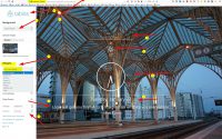
If I put this in an HTML file I get map of NZ in black, so I need to be able to control the fill of the regions. As per the Wiki page I need to colour code based on numbers in the region. I’ve used the wiki page and an Xpath
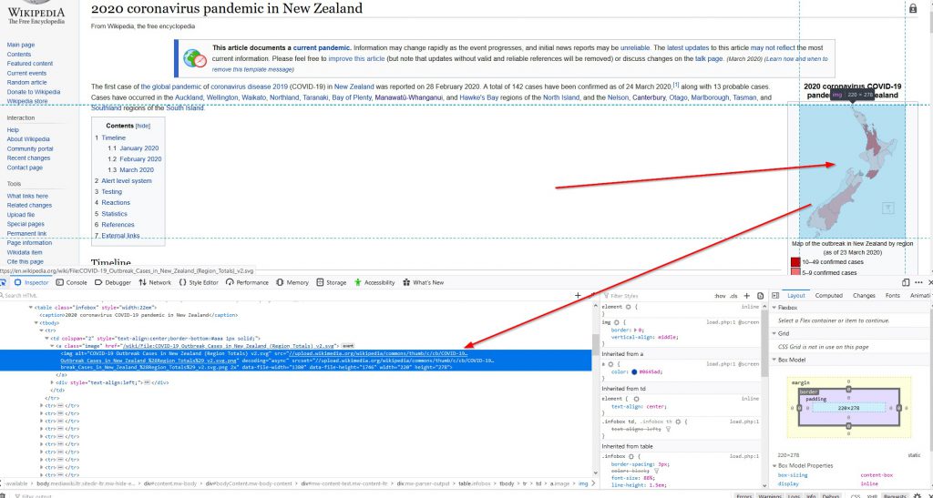
| url | https://en.wikipedia.org/wiki/2020_coronavirus_pandemic_in_New_Zealand | |
| xpath | //ul[3]/li |
and then used : =IMPORTXML($C$2,C3) to import the numbers confirmed in each region.
In the HTML there is :
I need to get rid of the :
onclick=”Drupal.behaviors.map.go(‘Canterbury’);”>and add in :
style=”fill:#ffc0c0;fill-opacity:1″Which will give the fill colour. Now the fill colour will be determined by the number of people. So I need arange of colours. i also need to rebuild the html code to put in the correct colour depending on the number.
There are 2 ways I know to do this, both rather manual processes:
One is with PyCharm with Python where I built up the script/file based on importing information from a spreadsheet that i used when creating Panorama files for multiple files of a project.
The second method is a type of concatenation within a spreadsheet. Then, after building up the correct information I need to cut/paste that information into an HTML file.
A follow on from the first process is that I could think of using Google Cloud and running a container that will run the python script daily to update the file, then open that html fil in a web browser. That may be a further iteration.
Back to the beginning
Initially as I was playing with this data I was thinking of creating some sort of GlideApp. So I started using Google Sheets to get the data using =IMPORTXML() to pull in the data, then use the spreadsheet to manipulate and display in some other format such as a graph.
So, now I have a source of data that I can grab from a web page (that is not generated by JavaScript) so I can now manipulate that information.
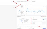
Now, in Google Sheets I can get a Bar chart for the data just fine. After importing I just need to chage numbers in text format to numbers by using =VALUE() function to convert, then the info works in the charts fine.
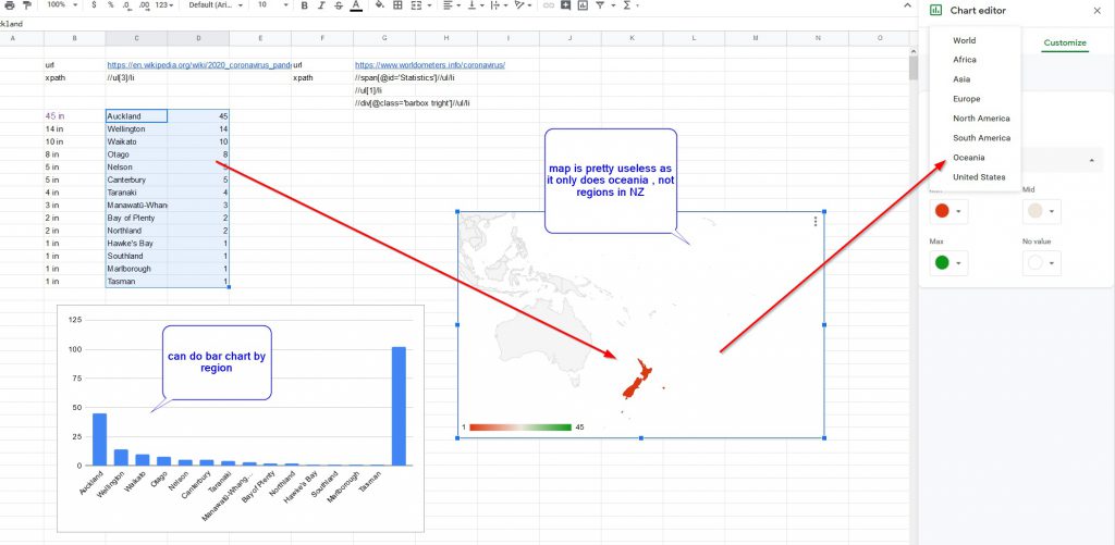
But for maps, the closest I can get for New Zealand is Oceania, and on a map it does not differentiate between NZ regional districts.
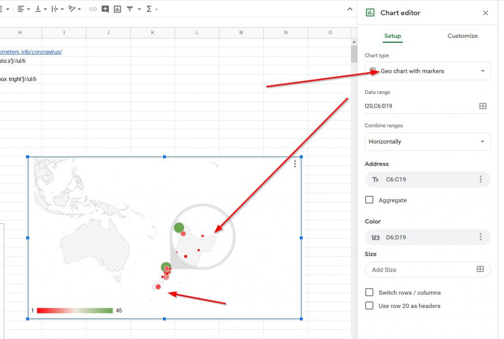
If i change to Geo Chart with Markers, it finds the regions, and you can hover over them to get the data, but you can’t zoom in on the map to NZ only.
Step 2. Map of Regions
So this is why I was investigating polyline regions to colour in in the above section. The problem is that i’m now creating an HTML web page to display the information. So that is not in Google sheets, so may not be correct way to display for a GlideApp. Or is it?
If i’m creating a HTML file I can just have a link that will pull up the map, and as GlideApps are just an app in a browser, so you can get a link to the map.
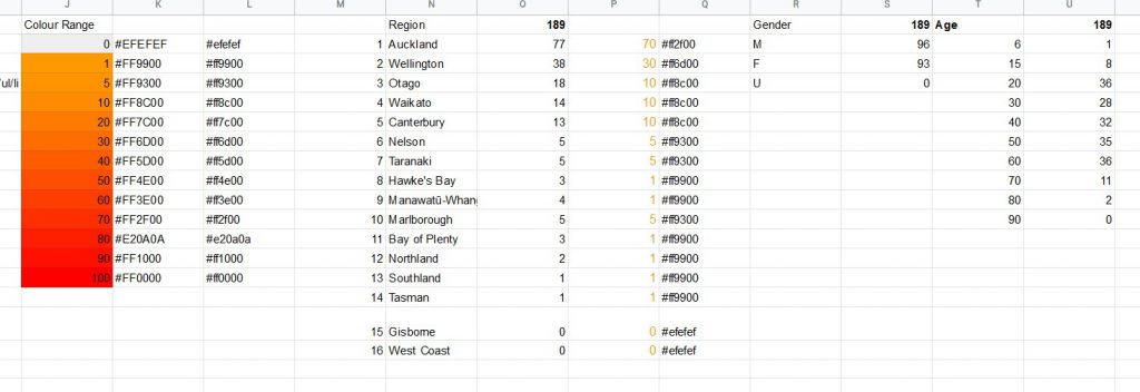
So far, I’ve pulled the regional data into Sheets. The next is to have a colour range base on numbers , and a lookup to get the colour code.
So I want a colour range. I made a list of numbers for the initial range (a bit low, but it’ll do for a start, and used conditional formatting on the range

Now I need to use a colour picker to find out the colours I’ve chosen for the scale, I’m using a FireFox browser add in ColorZilla that identifies the colour and you can paste the data into a list.
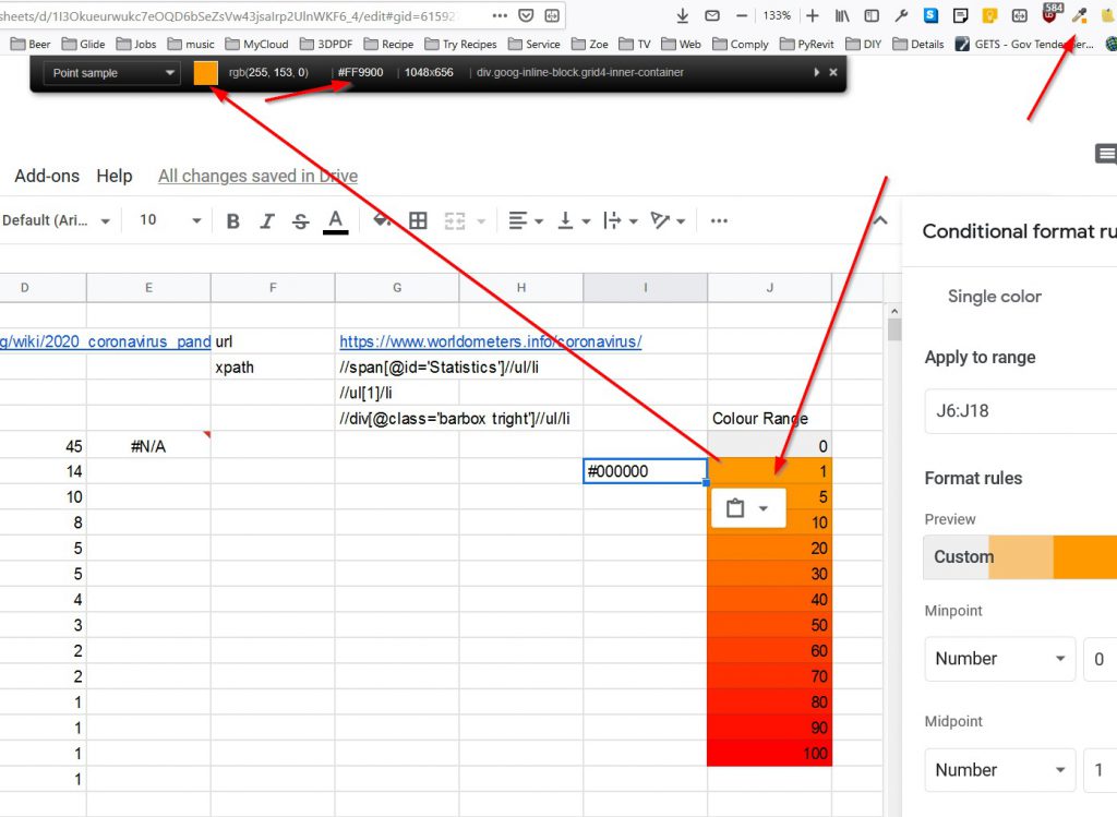
I then created a lookup to get specific colours associated with numbers, after first using =value(IF(E6>=10,ROUNDDOWN(E6,-1),IF(5<=E6,5,IF(1<=E6,1)))) formula to get numbers in specific range, so 57 , above 50 but below 60 would be rounded down to 50, 2 to 4 would be rounded down to 1, etc etc.
After doing this I could then use the colour coding with a lookup to choose correct colour for the region =LOOKUP(F6,$K$6:$K$18,$M$6:$M$18) which works fine as long as there is data, but if there is no data, like in Gisborne or West Coast, I dealt with this in the concatenation process next.

So on this new tab I set up the regions wth their specific paths, and they were not in the same order as on the previous page, so I used a lookup to get the correct colour , and if there was blank data for a region
I used the IFERROR to give it a Grey colour associated with no number
=iferror(vlookup(A16,’New Zealand’!$C$6:$FD$19,5,FALSE),”#efefef”)
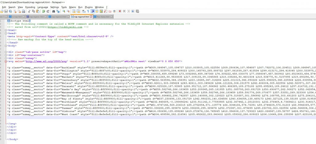
So next I needed to do a concatenation of the html for each area of the map with a color code attached to it.
=IFERROR(CONCATENATE($D$1,A9,$E$1,C9,$F$1,H9,$G$1),””)

So for each region I concatenated data with the polyline path for a specific region and the html coding for the other parts for each regio, this I cut/pasted into a notepad++ html file (with normal HTML page header etc) so I cxould run it as a file:
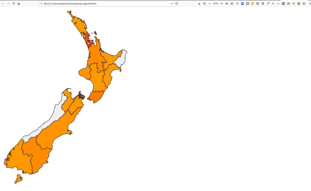
And the resulting web page generated is as below:
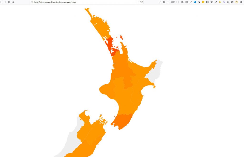
Which did not differentiate the different regions very clearly if the colours were the same or similar. To manage this I gave a black border colour with stroke=”black” . Also I changed the view area on screen to viewBox=”0 0 1050 1050″ from iewBox=”0 0 650 650″ so the whole map fitted on the screen
Legend on the Map-Stopped
I started to look at this then the data disappeard again due to web page update. It went from Xpath //ul[17]/li to //ul[28 ]/li but I couldn’t get the data back. So I thought I’d loook at the source data on Ministry of Health site: https://www.health.govt.nz/our-work/diseases-and-conditions/covid-19-novel-coronavirus/covid-19-current-cases
This is in a different format but I can use importXML to grab it. The data needs a bit more manipulation though.
I then thought I’d see if Knime would do some of this processing, but looking at examples it was not very elegant, so after updating KNIME I decided I wouldn’t go down that path.
So, after using the different data source I have the initial map & legend. I’ve used a container to split the screen into two div’s wwith map one side and legend the other. Scales all a bit messy at the moment.
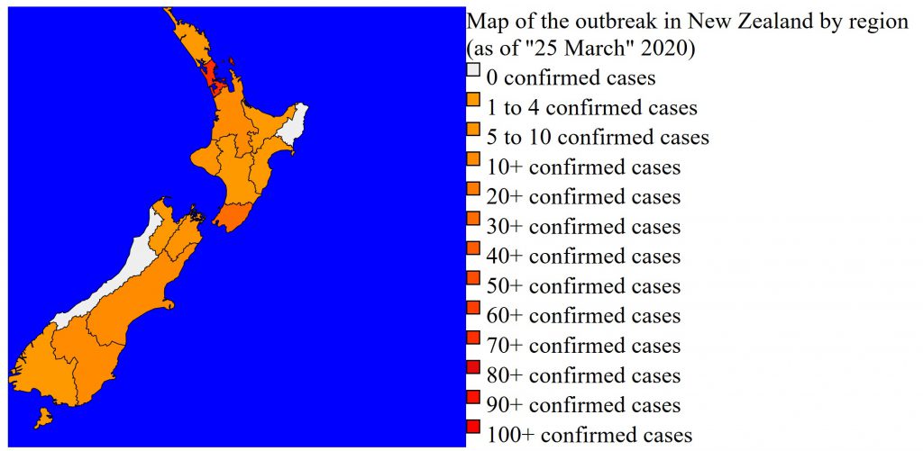
So far I’ve just got the basic legensd, but colour grade from orange to red not that clear. I can change that later.
The data I now have extracted is , Region and numbers by region, Gender, at this time almost 50/50 and age groups. There is some other data re travel and infection vectors that I’m not looking at yet. I want to tidy up the data first and get the other info displayed before I look at that.
I also want to look at population size re number of confirmed cases. I’ll need to web scrape that data from something like wiki, as that is not as dynamic I should be able to use Xpath more effectively to capture that data.
So ends day 2 messing with this info. I still need to label the regions on the map.