Covid by region NZ -map representation- Part 5
The Ministry of Health(MoH) have posted the original dataset on a different web page of each case and which District Health Board (DHB) they are under. The data can be found here. Instead of by region, its mapped to the District Health Board Regions. So the original map I was using in this post is not of any use. I have looked to see if I can get DHB boundaries, but so far have only found tiles or images, so no HTML <path> data.
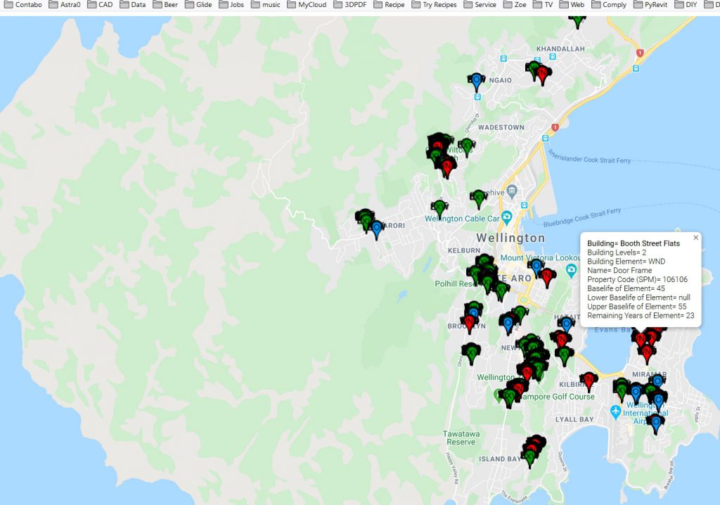
Point on Map
As I cannot get regions, I will need to put pins in a map which can show the data. A bit like what I did on this map with data which is linked to a database and it then displayed it on a map. I need to have not only a pin but also text as well to show the region.
Currently I’m going to play with the data first in Excel, then look at how I can push that into the MySQL DB on my VPS (virtual private Server), so the Google map can call the data and render it.
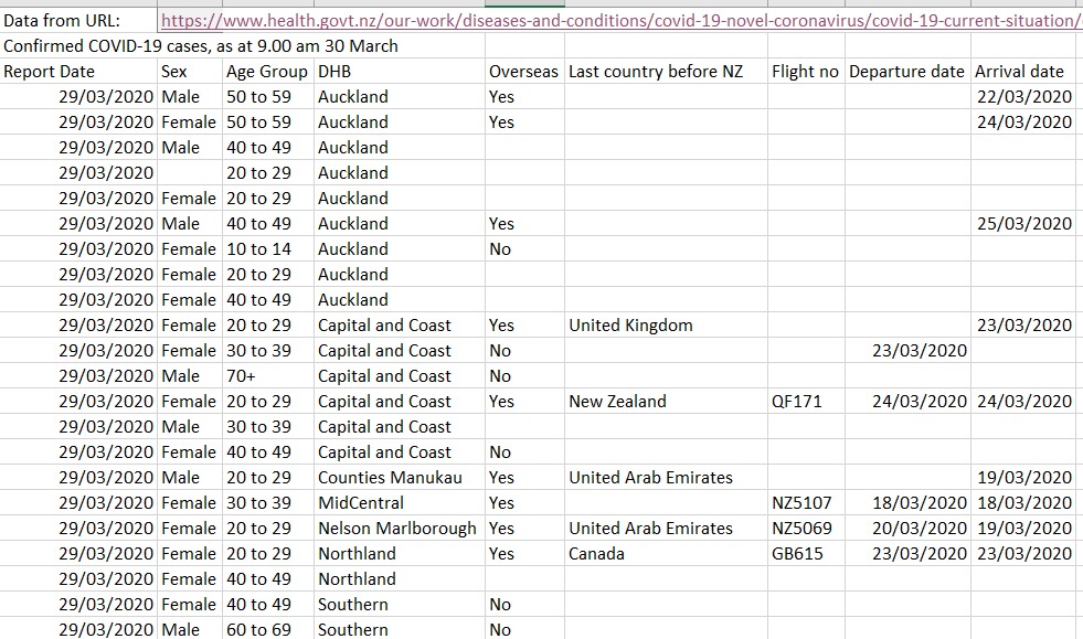
Excel from Web
I’m pulling the data into Excel with its Data>from Web tool. The MoH data comes in with the tables. I’m also pulling population data of DHB’s from wiki, and that pulls in the whole page.
I’m creating different sheets in Excel so that imports are on different sheets (easier to manage uploads and if they break its easier to track back). Format of data as below:
As this information has dates we can look at changes over time, such as rates of change). As the original work I did was in Google Sheets I have to rebuild the information sheets in Excel.
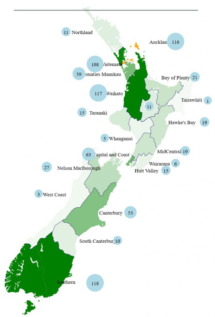
I found a polygon path in this article and had to do quite a lot to simplify to basic regions and boundaries. The NZ Herald has a really good presentation and I got the path areas from their map. They have a very elaborate coding for the map seup with all the contours shown, I’m not sure they actually inform but are there to look pretty. The left hand panel is more informative than the MoH web site.
Reviewing some of the data on the MoH website there is more information on this page, a bit more generalised but relevant.
I’ve spent a few hours cleaning the HTML to get clean paths for the regions from the NZ Herald page scrape. So will have to reupdate the Excel file as information updated. I’m spending more time gathering/organising/cleaning data rather than analysing it.
I used an ONLINE HTML prettify for the strings of HTML that I pasted into notepad++ as some of the strings were very long. Prettifying them sped things up heaps, and also showed how much content was in the file too.
So I now have a template to display data on. I better go and generate some.
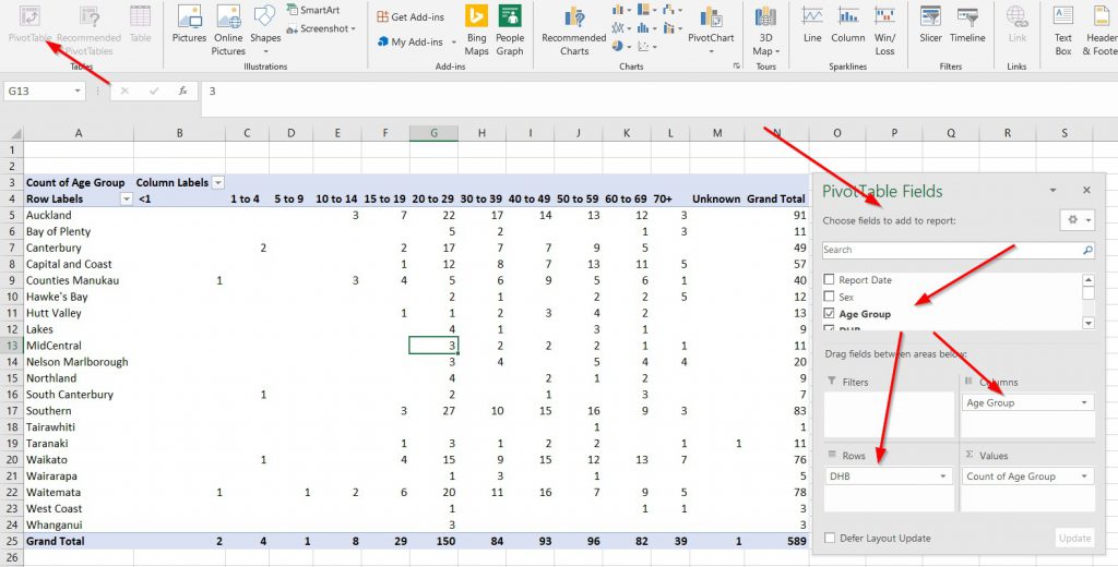
Pivot Tables in Excel
After pulling in the data into a table (not an Excel Table format, just rows/columns) I selected all the table and created a pivot table. Pivot tables are still a mystery for me but it collates things beutifully. I was trying to get a list of all the DHB’s and was trying to filter the original table into giving unique instances, when Pivot table elegantly puashes this data out.
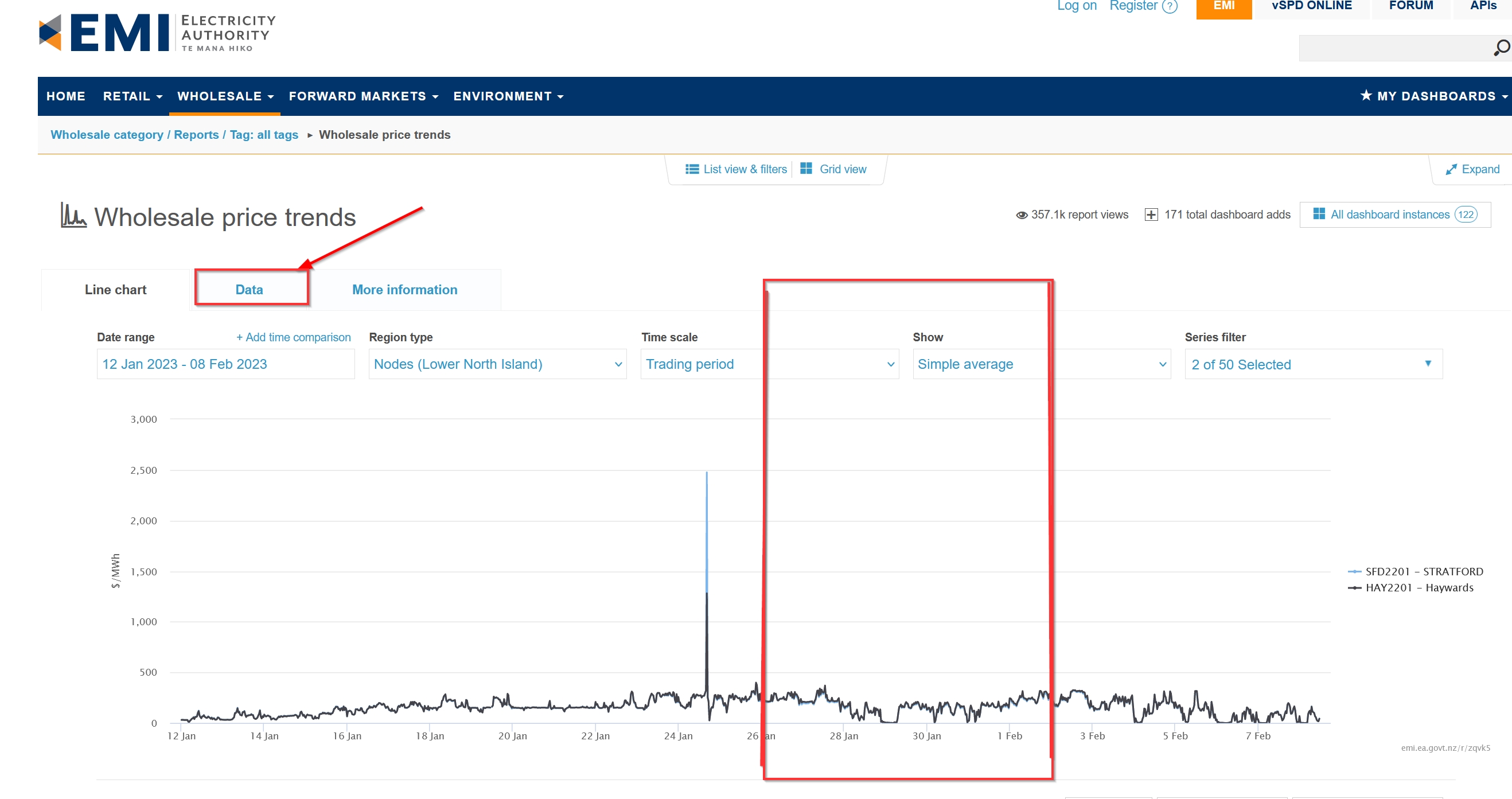
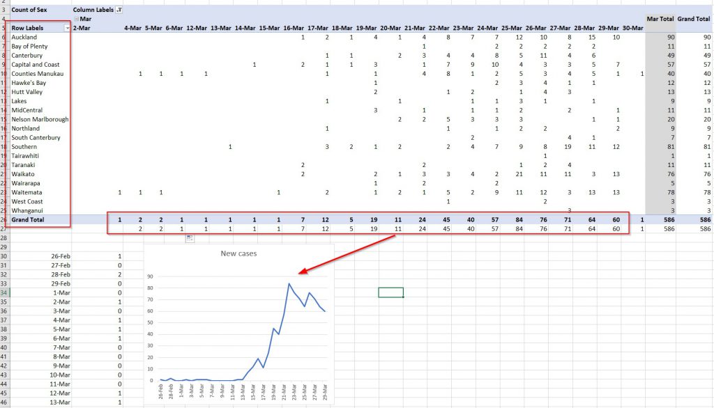
I have 2 pivot tables below, age range by DHB and Cases by date in DHB.
The Pivot table below has a graph showing new cases per day, that seem to be reducing from its peak on 25th March. Good to see that trend.
I’m going to go back to getting information from the website , especially ethnicity and transmission.
Analysis is basic
On reflection this is pretty basic excel analytics, its only taking the data and putting it onto a map that is different. Although simplistic, the filters help quickly reorder the data to see trends, I’m finding it tedious getting deaths/recovered from the BIng Tracker and Hopkings maps. So although simplistic, it is far quicker to get ordered data ohewr than confirmed cases.
Excel to create HTML for map
As I don’t use Excel that much, its still useful. Also its great for concatenating data for the map so that you can change part of map style quickly by adjusting one part of script.
I’ve now built the whole map, Regions, Borders, Labels, Dots & lakes (a feature) into Excel so that I can easily chage colours and features.
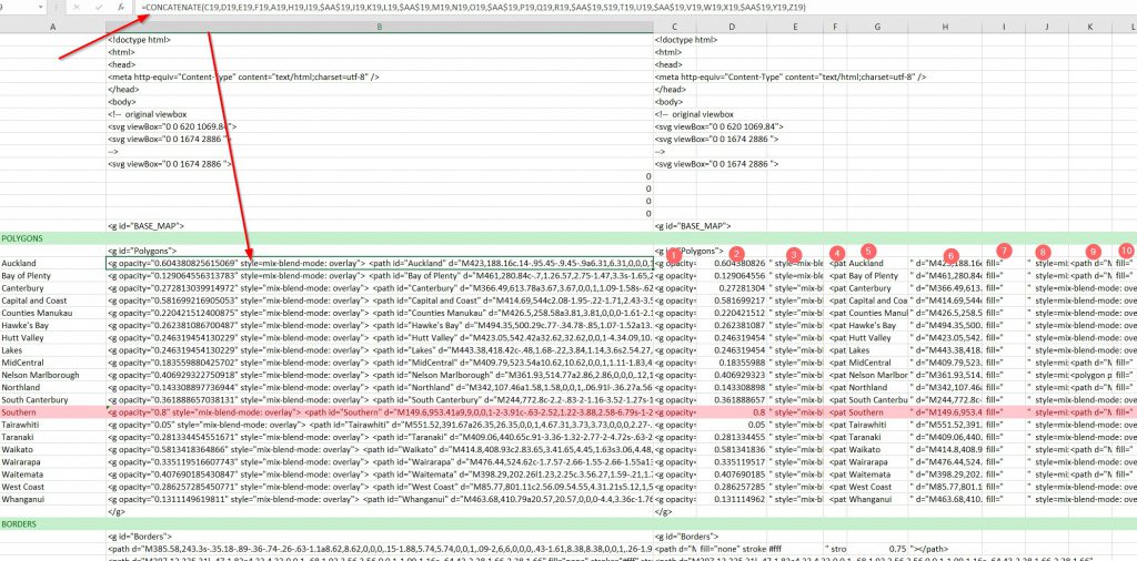
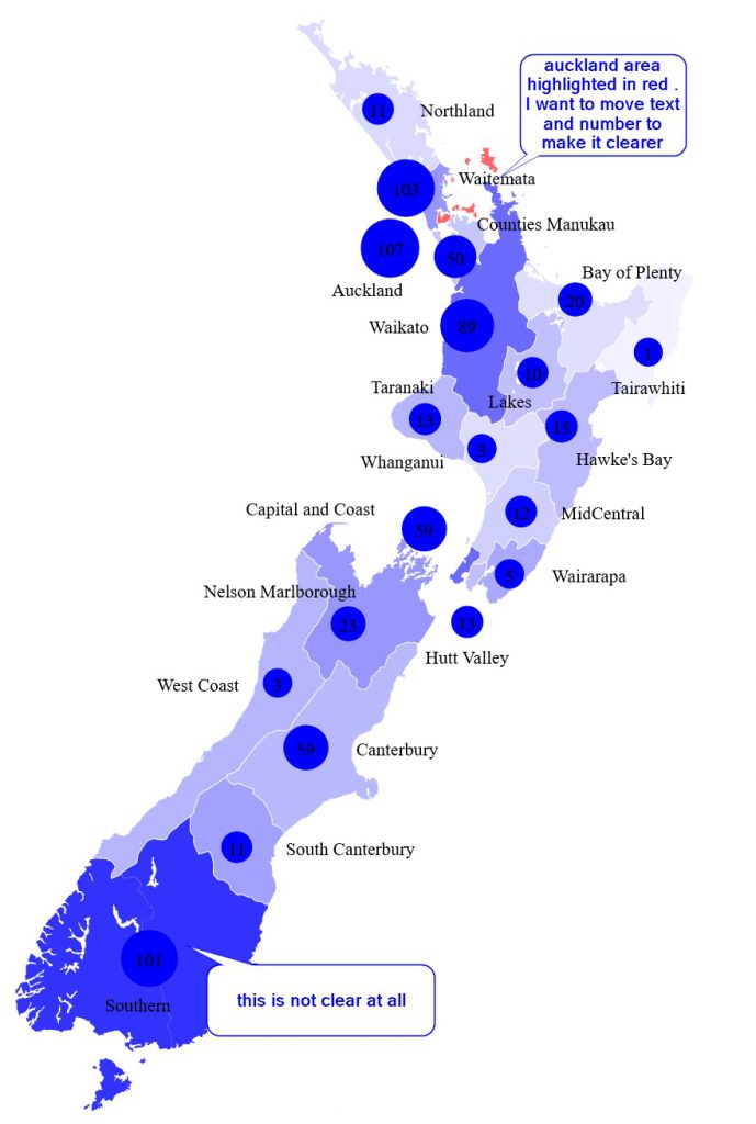
original map was in red tones, I’ve changed colour to blue as a test. The opacity of regions can be changed, I want to experiment with opacity based on numbers. Excel is good for this as you can just put in a number to change the opacity as a fraction.
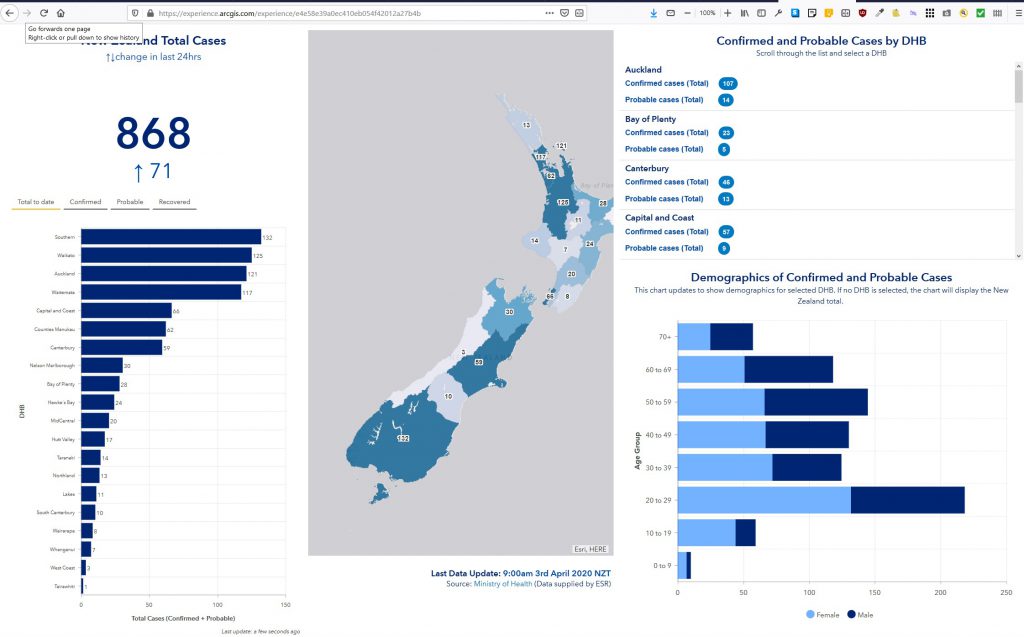
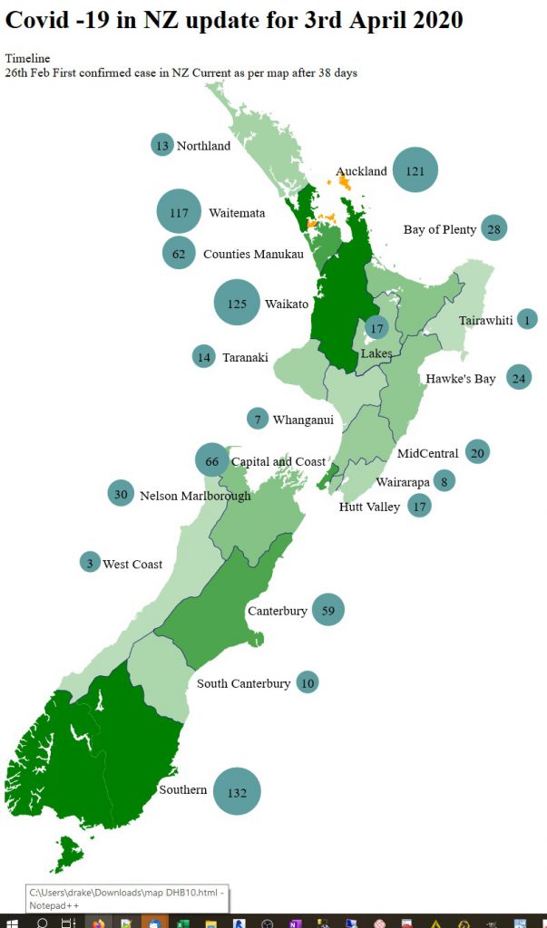
MoH on friday 3rdApril have started to do ArcGis charts as well:
I’m still playing with layout of Map, happier with position of numbers but colours and transparancy still need some work. I may have to do conditional colouring for different values to have densities the same. It took a lot of mucking around getting text alignment right. I may have to do a range of colours from say blue for low numbers, green for mid numbers and red for high numbers.
The map above has the regions reversed coloured as I do not have coast outline so light colours fade and you can’t read them Tairawhiti and West Coast, would disappear into background. Maybe that is solution, change background colour (didn’t work).
In the end I added 25% of max value to all the values so the lightest hues started at 25% saturation up to 100% with the formula below so formula is = (25% highest value + Lookup DHB BValue)/Highest value so for map below it = (33 +1)/132 (for Tairawhiti, where lowest at 1), saturation defines region better. Excel formula:
=(ROUND(MAX($J$38:$J$56)0.25,0)+VLOOKUP(A64,$I$38:$J$56,2))/MAX($J$38:$J$56)
Loading data is getting easier because MoH are doing a better job processing tables so easier to find a specific table and pull that data rather than the complete list of confirmed and probables.
Spending a lot of time with Maps, learning about paths, excel structure for map data and different components. I’m still struggling with containers and I’d like to get Hover pop up windows to be able to add another layer of information to the map.
the stuff map does this well. but overall a boring map.
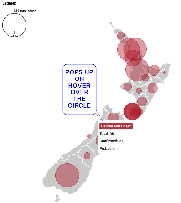
This one actually calls data from a database to an xml file which then displays it.
End comment
It has been quite time consuming getting basic map setup and extracting data and HTML structure from Excel for building and adjusting the map. I’m happy with its current iteration but want to go 2 steps further and get pop-up box on mouse hover and also get containers for web page.
I’m wondering if I should leave the map and move onto building a dashboard with something like Google Data Studio or PowerBI. Google Data Studio will need to have internet access so could be slower. Maybe PowerBI desktop would be the better way to go as my data is residing in Excel.
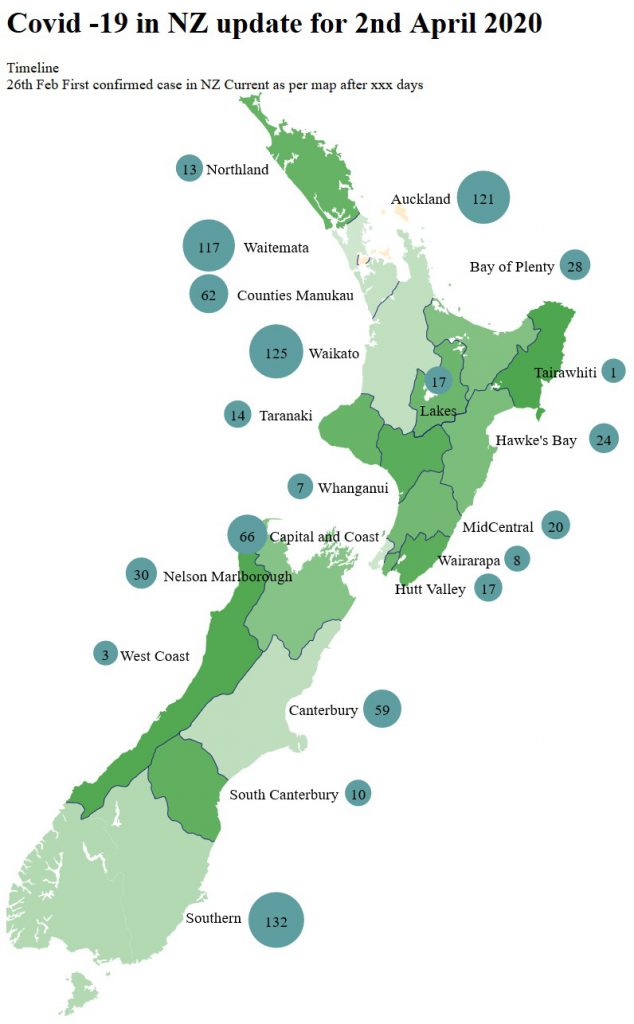
Covid -19 in NZ update for 3rd April 2020
Timeline 26th Feb First confirmed case in NZ Current as per map after 38 days