Visual Asset Strategic Tools. Capture Building Information for Building Life Management. Open Source/Low Cost Technology Solutions for you to control your buildings
This is in fact an article How to import JSON data into Google Sheets to create a live COVID-19 chart that I came across on my RSS feed from Datawrapper. I want to follow this as it sort of comes full circle. I’d started my covid data exploration with Google Sheets and importXML() and now,
Developing my covid map using API data pulled in in JSON format has caused me some grief. I have spent a couple of days with no progress at all trying to get variable data pushed through a function to use in a JS Template literal. In the end I had to wrap the whole thing
I m very excited as I’ve found out about JS Template literals, I think I’ve used some in code but was not aware of it. The video below is a very good tutorial: There is also a link to Codepen of 1/ the basics, so you can follow along, and the complete solution HERE. The
After pulling the data from an API ans displaying it in a web page Chart, and developing a crude selection list for different countries and dates, I started to think about creating my own API as a project. As I looked around for data I came across Dixon Cheng’s Github repository of Covid-19 data scraped
This is definitely worth my time. Up until now I’ve been using Notepad++ to do my code editing, and after adding code, I have to save file, go across to browser and refresh page to see the updates, so I’m constantly jumping between programmes. Quite distracting. The video below shows you how the Live Server
I want to play with 1/ Covid Data & 2/ API’s. I’ve done some bits with Postman & API’s before but not very successfully. So this time I’m watching the following video: It is pulling in the Postman scripts for the API calls and I want to follow on with what they are doing. After
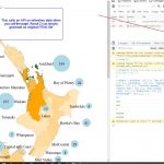
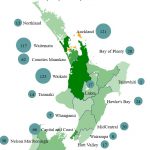
The Ministry of Health(MoH) have posted the original dataset on a different web page of each case and which District Health Board (DHB) they are under. The data can be found here. Instead of by region, its mapped to the District Health Board Regions. So the original map I was using in this post is
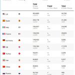
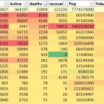
I suppose I could use PowerBI but I’ll srick with Excel for the moment. PowerBI has the dashboard but I did find it slow, its speed may have improved but that is for testing another day. I’m using the John Hopkins Github repository of Data which is updated daily and what they use for their
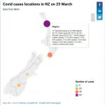
At the end of the last post I’d found that the original NZ regional dataset had changed. I was also finding it slow working in Google Sheets as the interwongle seems to be slow with so much demand. So I decided that I’d start working locally. My current process is to get the data, manipulate
At the end of the fist part I’d got some data to play with from a couple of sources, cleaned it up, got some data to make paths to create a map and coloured map in by region based on covid cases. This was done using Excel, Notepad++ and displayed in browser. I was just