Covid Globally -Rates of change visualisation- Part 4
I suppose I could use PowerBI but I’ll srick with Excel for the moment. PowerBI has the dashboard but I did find it slow, its speed may have improved but that is for testing another day.
I’m using the John Hopkins Github repository of Data which is updated daily and what they use for their dashboard. This has daily data and keeps data for each country from 22/1/2020 onwards. So its good dataset to use for rates of change. I have cases/deaths/recoverd in seperate CSV files that are updated daily. I have cut/pasted this data into my Excel spreadsheet.
I later found the same data in a single column format that was easier to use. It can be found HERE.
List Lookups
I thought about having a page with a chart that you could choose countries and look up data and compare to other countries, looking at series over time. It would be a good start to look at rates of change.
I’ve been thinking about using logarithms so that scales can be compared between smaller and larger numbers on the same chart. I need to see what Excel formula there is for that (=Log10()).
I setup a country lookup on the right, using Data>Data Validation to make a list to pick countries from (not that flexible and lots of scrolling and you can’t type first letter to get to part of list you want) and then set up the pulling in of country data by date, based on Confirmed, Deaths & Recovered (& getting Active numbers from subtraction of last 2 from Confirmed). Getting the vlookup to work on a table with so many columns for each column was a daunting task, but ended up using: =VLOOKUP($B$2,’TS confirmed’!$C$2:$BR$249,COLUMN(Q1)-COLUMN($A1)+1,FALSE) where you subtract first column from another column, and as it grows you are able to get correct lookup column. I woyuldn’t have thought of using thatmethod but it works great, the joys of internet resources.
I then copied the set down and did it to Log10() with an iferror for 0 to replace with a 0. This just meant that the number 0’s in the column were counted as 1 in the dataset.
I made two charts, one normal, one Log Based. lots of lines. Also quite tedious in Excel to get the lines to consistant colours.
I used a China province as that data had reached its peak and was in a different shape to all the other data , US & Italy. In the Log graph all the lines are in the same area, whereas the One on lft the Deaths and recoverd are very small scale as the Confirmed numbers overwhelm them because of magnetude.
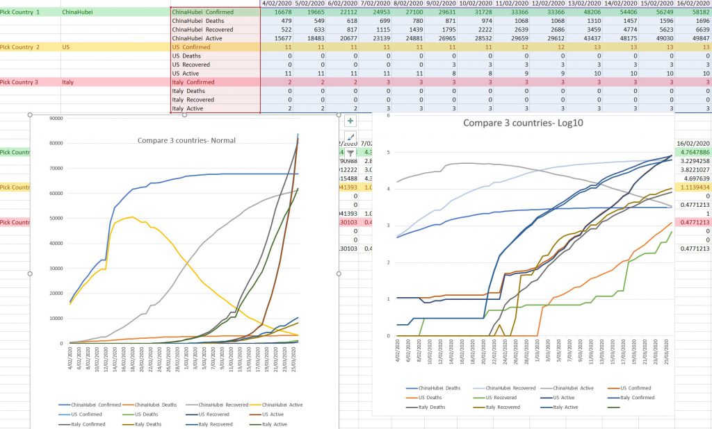
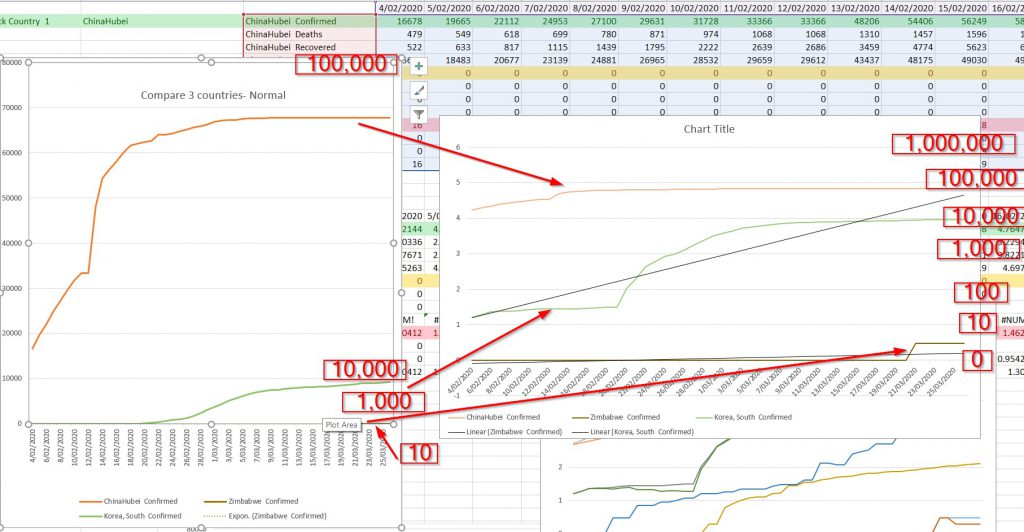
I found the graphs above a bit too confusing, so I simplified them to just confirmedcases and used 3 different countries, one with only 3 cases, one with just under 10,000 cases ,and the Chinese one with about 70,000 cases.
The Log scale shows how this works, depending how far up the graph the lines go, as the next horisontal bar up is 10 x as great as the one below, so you can see what band the information is sitting. so anything between lines 6 and 7 (numbers on left side of Right hand (Log ) Graph will be between 100,000 and 1,000,000, whereas anything between 0 and 1 will be between 0 and 10.
I’m not that impressed with the Excel Charts, a lot of messsing to make neat, so I’ll most probably play with the data and export it to a CSV file for using in DataWrapper later.
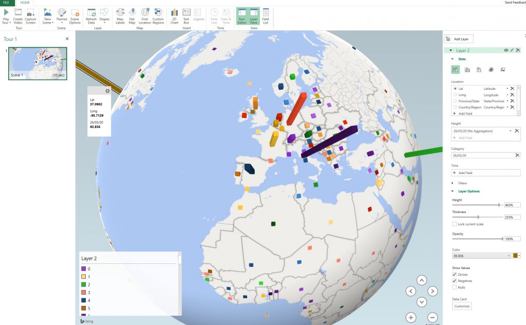
Mapping spread over time
The other thing the datasets have are logitude and latitude coordinateds for the data, so this can be displayed on a map.
I spent a lot of time on this and found the 3D map a bit temperemental. I had
I also did a quick video on using this Excel feature here:
That has been a bit of distraction to me. I have now found there is the original Min of Health list of all cases in NZ who have contracted illness to date, so I want to play with that dataset again.