Building Data Wrangling for Analysis using Power BI, Knime, Excel & SQL Express
This is the LINK to the report.
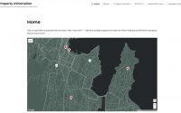
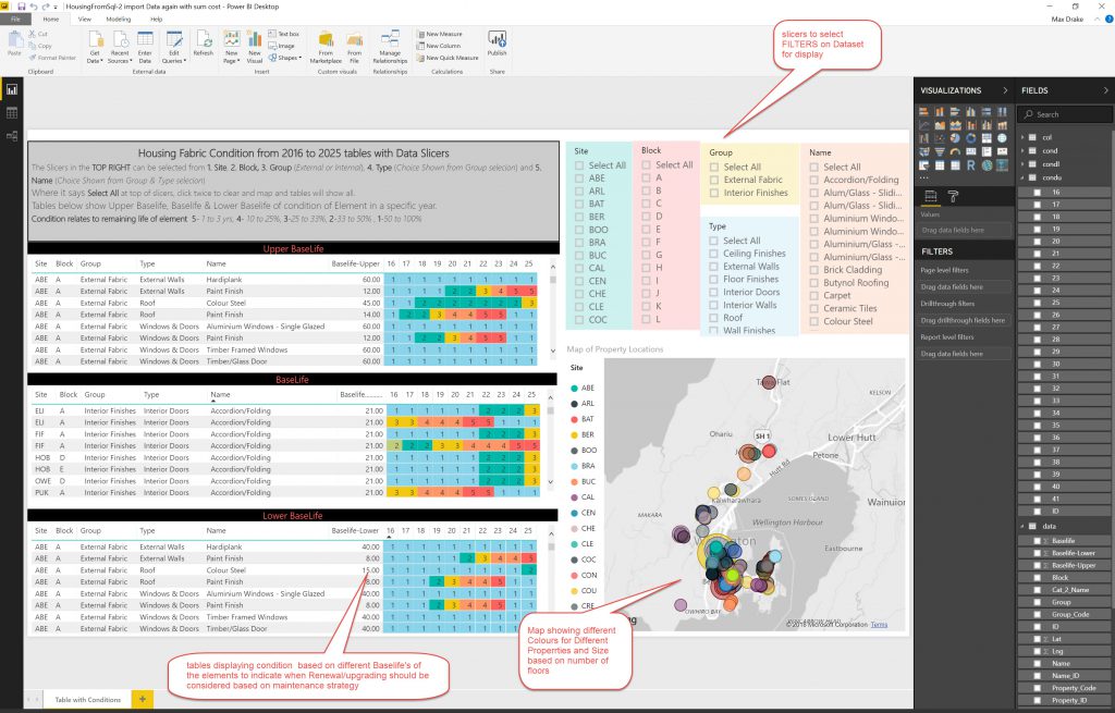
The idea is to use powerBI to display data about different elements on a Dashboard so you can drill into the data. In the above screenshot I have tables showing Standard, Upper & Lower Baselife Data with conditions by colour and a map referencing where the properties are located, as well as SLICERS/FILTERS to be able to drill down into the data. I have taken the display from 2016 to 2025 but there is data up to 2041.
Preliminary Data & requirements
Initial start was with 2 CSV tables:
- 1 table with all the condition data from SPM Database
- 1 table with coordinates of the location of buildings (lat/long)
Elements that are required are:
- Latitude/Longitude of each property
- Condition on each year for the future
Also use different baselife’s (estimate of life of element – eg gibraltar board lining has Standard Baselife of 51 years, Upper Baselife of 60 years and lower Baselife of 40 years) to be able to plan for best/worst case when you need to interact with data
Step 1.
This is to get Lat/Log for all the elements into one table, so all elements can be located geographically.
Initially I used Power BI as it has a nifty way to split columns into component parts ( like Excel Left, Right, Mid functions) and then append the Lat/Long data to the property elements on each row.
Use Power BI to join the 2 tables. Split a single property code (for each element) into separate columns to be able to get Site Code/Block Code/Unit Code & Room Code separately.
I then create a column called SiteBlock in both tables so that each element related to a block on a specific site has the same SiteBlock code. Use SiteBlock combination to use a JOIN command between the 2 tables to get the Lat/Long coordinates appended in columns to the element table above. I used the Relationships Tab and the Manage Relationships to create this link (it shows an error on screenshot below because its already been set up).
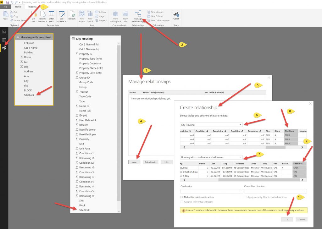
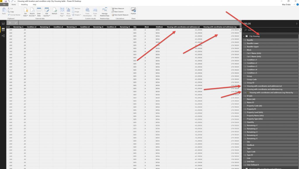
After creating the relationship I then added the Lat/Long columns across to the Main element table. After doing this I want to export the data to process it in Knime.
Then I exported the modified Table to CSV file.This is an issue in that the original dataset is big and the export to CSV function will only let you export a smaller dataset (not exactly sure of the size).
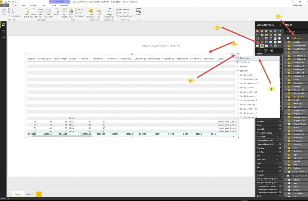
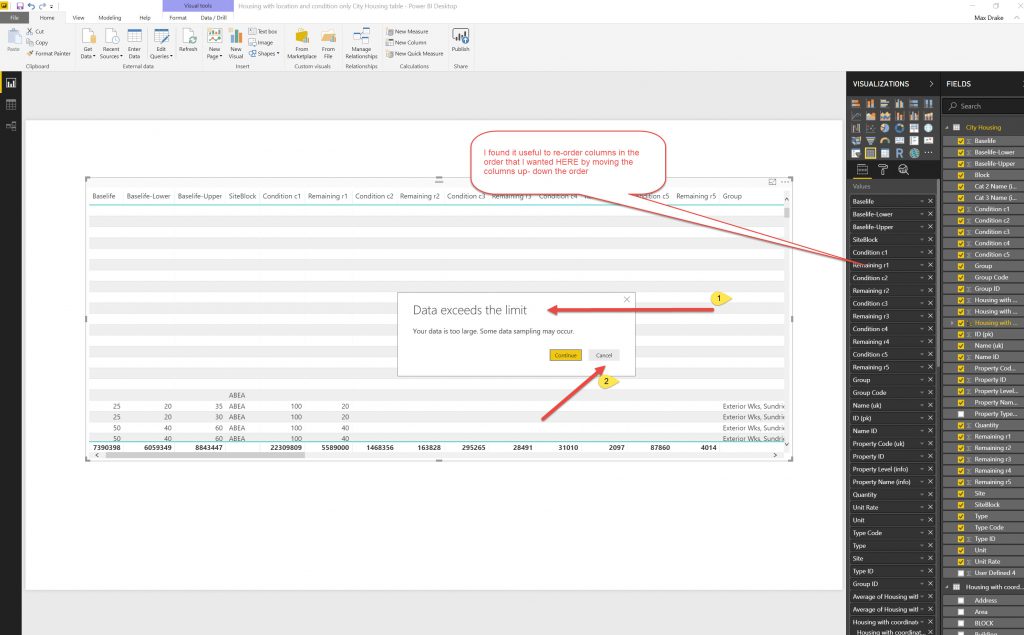 So as the Data exceeded limits for export file. I used Slicers to Reduce the DataSet Size and exported to several files.
Using the slicers allowed the Data Export to be small enough such that it would actually export the data. I had to do this by trial and error and make as many files (about 12) so I could export the whole dataset.
Step 2.
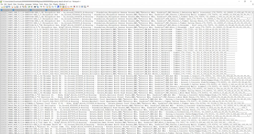
I used Notepad++ to combine all the files. This is to get one CSV file to plug into Knime- An intermediate step due to Power BI output.
I used notepad++ as it is quick with loading & cutting/pasting Txt files. I copied a CSV file and renamed it to use it as the main file (notepad++ does not seem to have a .CSV file type, only txt equivalent) and then opened all the other CSV files in notepad++ and copied/pasted across to the main file. I have noticed that Excel can be a bit slow doing this process.
Step 3.
This is to get each years condition through the Knime Workflow for Year Condition- Baselife Upper & lower. This comes out in separate files and then these need to be combined
The CSV file was uploaded into KNIME for processing with the Heatmap from BI workflow.
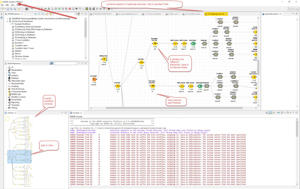
This has a few things altered to make it work. ID_(pk) changed to ID1_(pk) and I had to change “space” to a “_” in a lot of column headers in the CSV (I don’t think they made the round trip from Excel to power BI to CSV so had to be added). Also wise to leave the column headers as is where possible so KNIME process works (As it was based on the original Excel SPM data file- so keep naming conventions).
Some of the output files are appended (onto an existing file) and need to be done one by one as the files get large, also the Knime process gets a bit confused when
The property_ID was a bit fuzzy as one was “1” so that wasn’t good.
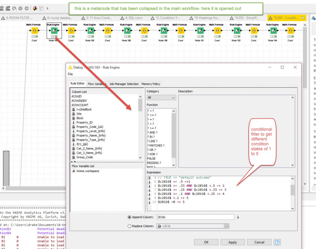
There are some metanodes that locked up and needed to be adjusted and some of the target columns within the metanodes pointed to wrong column and needed to be altered.
I had an issue with the Excel CSV Output files- There were Java errors as the output directory wasn’t on the computer and it would not let me configure the WriteToExcel nodes to alter that. So I had to create the directory and then create some blank files (from seeing names and directories in the Error log at bottom of Knime WorkSpace). After closing it a couple of times I finally got it to work. (I may revisit this later and see if I can push the data directly into an SQL database table).
I exported to seperate files so that I could check each one individually and also I could run some of the exports at the same time as they were different files. If it was a combined file I would have to export progressively one after the other. I found I could combine the files faster outside of Knime so set it up for that method (see next step).
Step 4
This is to setup files for Excel for uploading into Database (file lengths over 111,000 rows). In this case there were 2 files for each of the 3 baselifes, so 6 files in all, with multiple sheets (wall substrates, wall finishes, ceiling substrates, ceiling finishes…..) .
I cut and pasted different sheets into a single sheet. At this point I saved the files (3 off one each for Upper/lower/normal baselifes) and checked they were all the same length 111,623 rows long. They were.
Step 5.
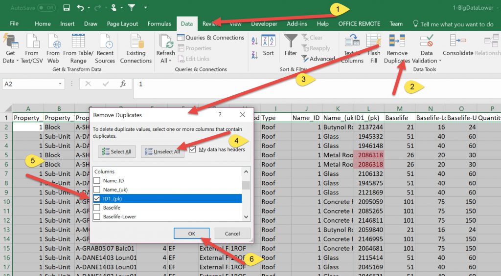
This is to format/clean data as I had quite a few duplicates.
I actually did a cycle of some of the later steps and found errors. So I looked to see if there were duplicates. In the dataset I used the ID(pk) as a primary key as it had unique numbers.
The idea is to reduce repetition in datatables, so as there were Condition tables I split these into 3 files with the years (2016 to 2041) and the ID column. (U,L, Normal) and had a Data table with all the information about the elements and their coordinate.
The first time I had 111,623 odd rows in all the files, but when I brought them into power BI I could not make Relationships between the tables (it couldn’t autofind). The reason was there were over 800 duplicates.
So in all 4 tables I had to open Excel, pick ID column, use conditional formatting to check to see if there were duplicates
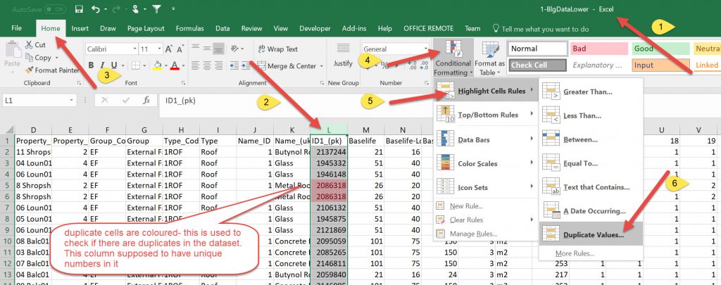
After identifying duplicates I then had to click on an arbitrary cell and use the Data tab to remove duplicate rows.
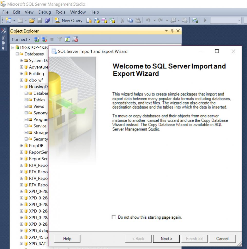
At this point I changed the format of the files from Excel (.XLSX) to CSV. This is because I wanted to use the SQL Database to store the data. In MS SQL there is a wizard that lets you upload from CSV and creates the tables.
Also had to go back as in Database some of data in columns shifted over as there was a text string on the addresses with 34 Shropshire Rd, Bldg
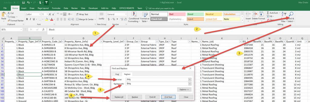
As this was a comma deliminated file and there was a comma the Blg shifted to next column over and messed up the data. I had to use Find/Replace in Excel on that Column to remove the” ,Bldg ” so all the data lined up correctly.
Step 6
I wanted to import into Database as this manages big datasets better and power BI also loads from SQL easily. The idea is that you have main data and can choose upper, lower or Baselife for buildings to view.
I could have just stayed with Excel but I decided that I wanted to use the SQL database for 1/ A learning exercise using multiple tables in SQL (in the past i have only used one table for my data) and also Excel can be a bit sluggish with large datasets.
So I created a New Database HousingDB.
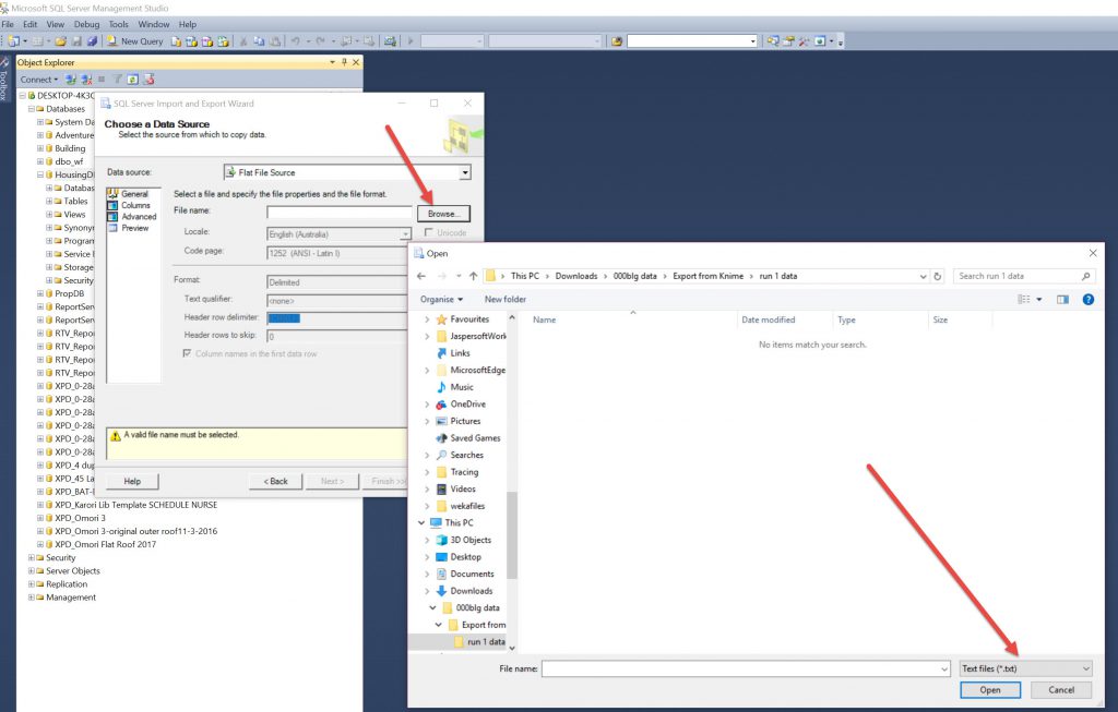
Then in Database Right Clicked in Tasks for import Data and used the wizard to import from Flat Tables and chose CSV (it defaults to TXT and shows no files) and uploaded files . Also renamed them to data, cond, condl, condu

Note, when you go to browse for a file its default file type is TXT, so you have to change this to view the CSV files.

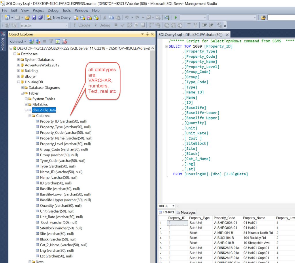
One thing to note. When importing in this manner it sets up all the columns as type VARCHAR. So you may need to go and alter these to different types such as Integer, Text, Double etc depending on what you want to do with the data. ( Note- See bottom appendix- I did alter the tables but it was a longer process than I thought)
I then did a few QA exercises:
- Selected each table and did a select * from “table” to see the count. They should all be the same (now 103,049 rows
- using an INNER JOIN on Data and each cond table, as inner join is a 1 to 1 match from each table. As the ID is unique it should be a perfect match of 103,049 rows. If it is more then there is something wrong (duplicates if more or no match if less).
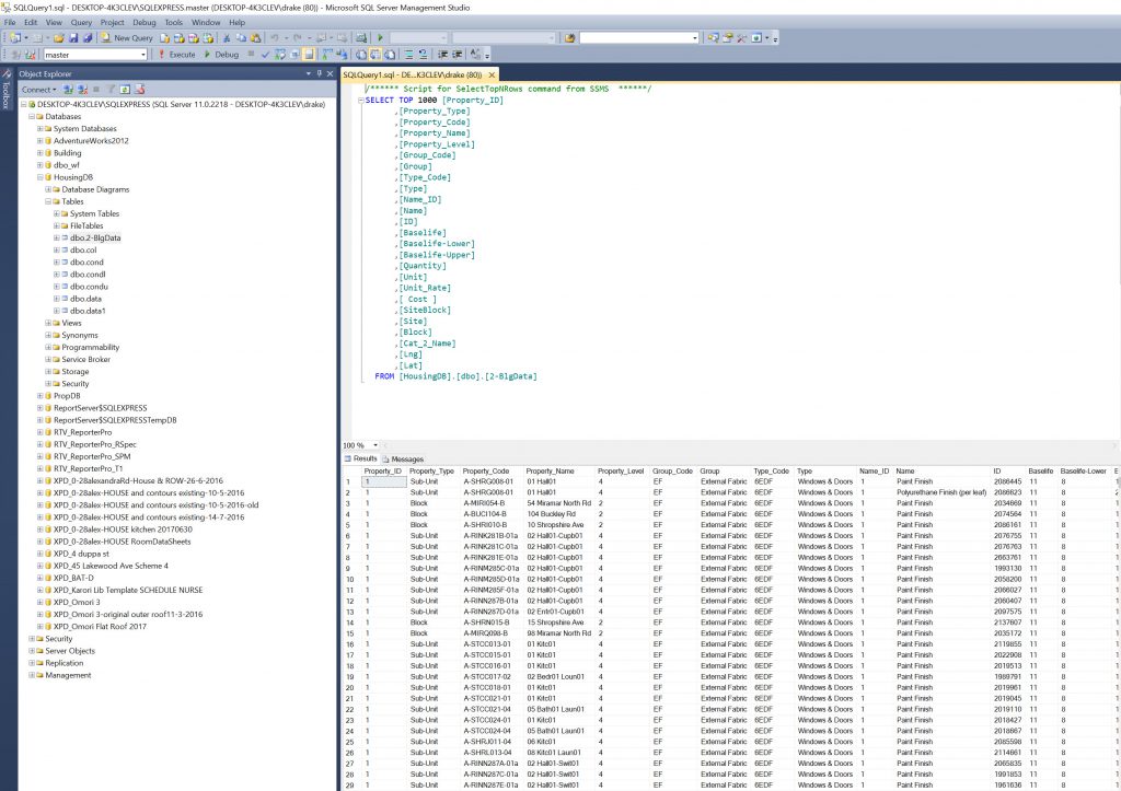
SQL: Query:
use HousingDB
select * from data
INNER JOIN cond ON data.ID = cond.ID;

As you can see there is 103,049 rows of data. This is the length of each table so a perfect match. If there were more columns then this would infer there were duplicates, if less then there were lines missing in one or the other of the tables.
Pause.
So now we have clean data (to a point, still have blocks and units and sub units) but that is data we want to explore.
The idea is that we can bring the data back into BI and try and put it on a Map with a lot of Slicers.
The slicers should be able to filter the data so it displays different data for exploring. A bit like the “Map of Conditions over time” with more controls and also able to export the data in the report to CSV and also a bit like the “Excel HeatMap” except with location- to identify patterns of similar events in close proximity, also to filter by different Baselife’s (based on this Heatmap).
Step 7
PowerBI to display data.
Why?
Different visualisations and dynamic.
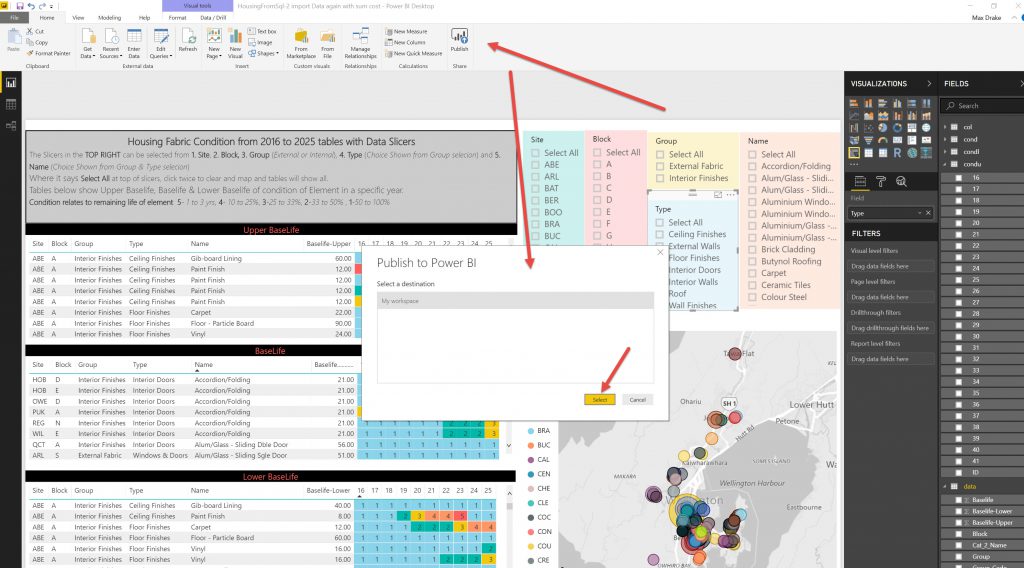
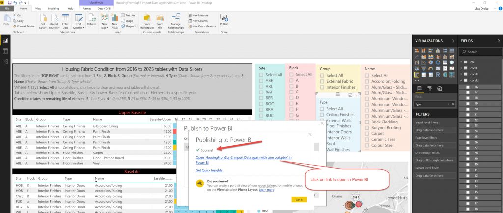
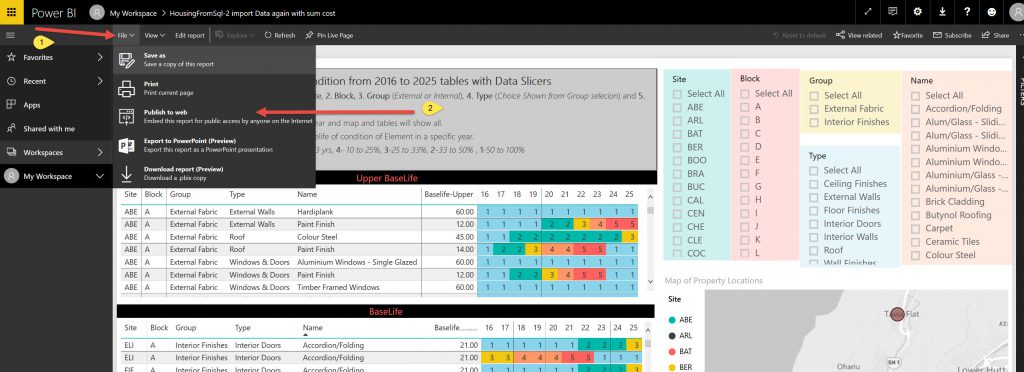
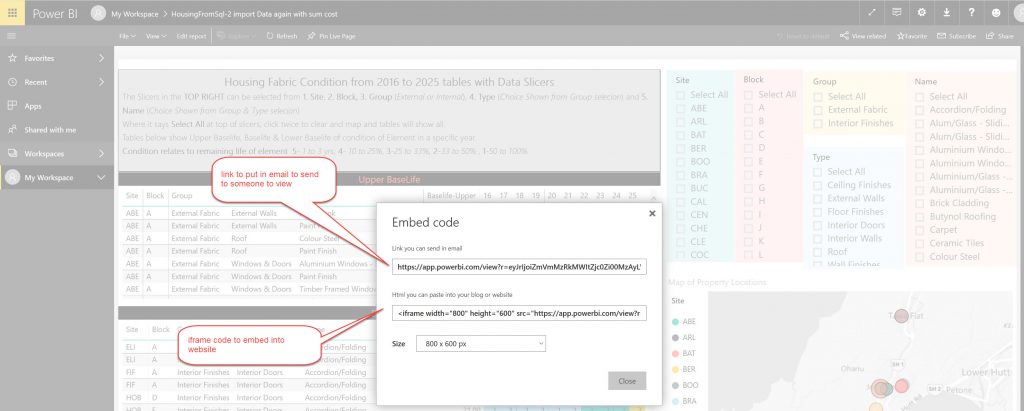
Although issue with sharing, can only send a link via email & upload to web in the free version.
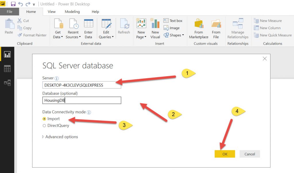
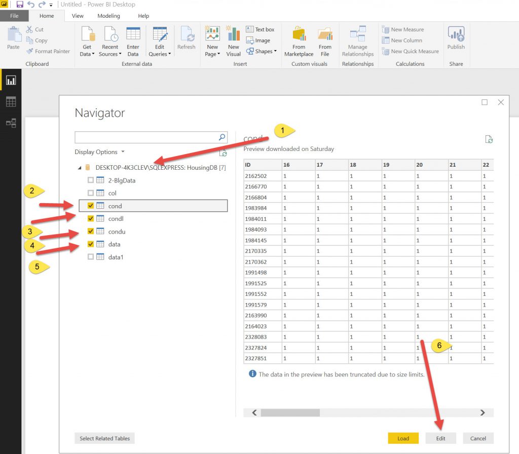
First, I connected to the database from Power BI and connected to the tables.

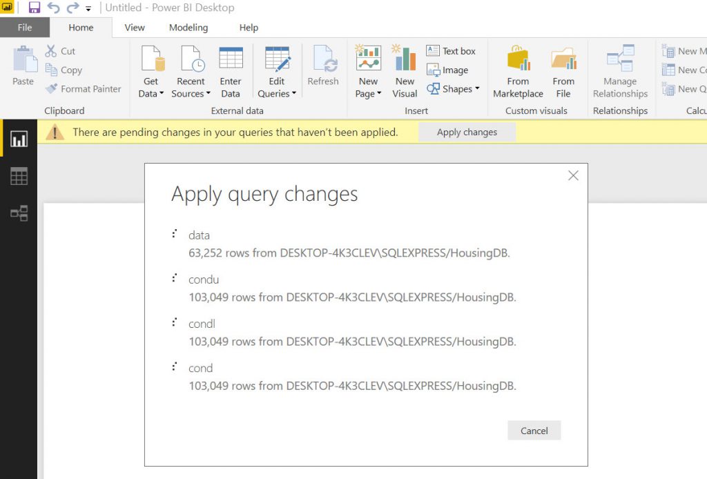
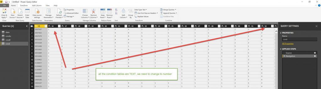
After bringing the data in, you can see that all the condition columns are formatted as TEXT (that is what they are in the SQL tables (Varchars)). So we need to change them to Numbers.
Select all the column headers, select Data type and change to Whole Number.
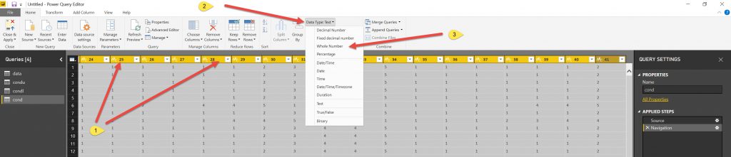
The data type will change. Do this for all the other data types that you want. (Actually it would be better to do this in the database so if you are using the data in other reports you do not need to reformat again (Ain’t learning fun!)).
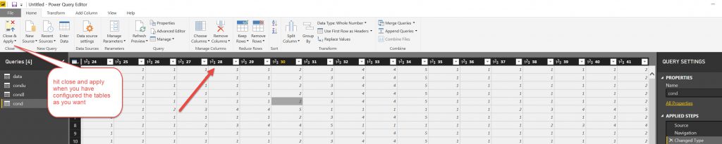
Hit the close & Apply button on the Left in the ribbon and this will take you to the main visualisation page of Power BI.
Note, if you need to go back and readjust the columns then use the EDIT QUERIES button (3 to the right from GET DATA button).
My intention was to show condition on the map but I have not been able to do this to date. I will think about it some more.
So I ended up using Heatmap tables , one for each of the BaseLife’s to show condition with slicers to dynamically adjust the data and & a map to show the location of the sites where the buildings are located.
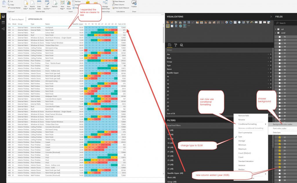
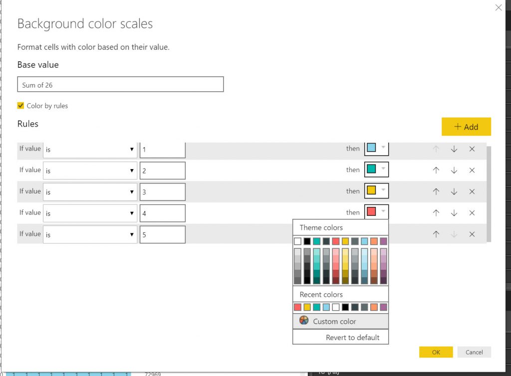
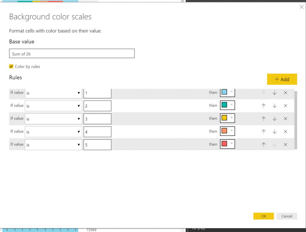
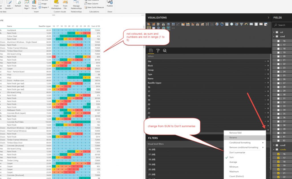
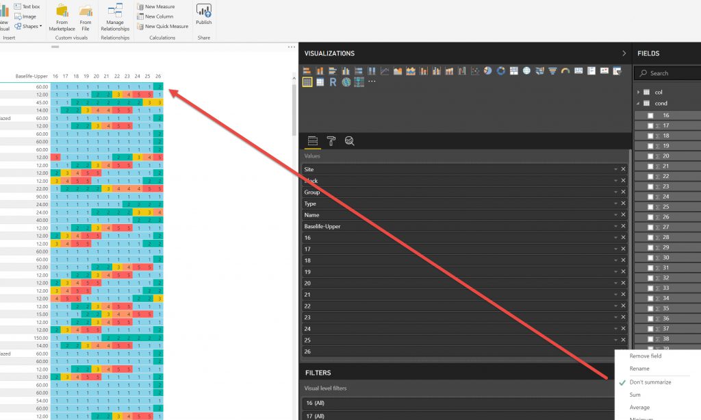
I used the same method as above to make Tables and slicers as above where I used them to export data. This time I set the,m up a little more elaborately but the principles are the same. What I want to show here is the method of showing conditional formatting for the YEARS in the tables, so that they show the Condition colour. This was not an elegant process.
So, after setting up the Report you need to upload it to the Power BI cloud.
End thoughts.
There were a few things I could have done more efficiently in the process. But that is in hindsight. Setting it up was a learning process to see what could be done.
- Maybe not use the SQL database for tables. This would have saved some cleaning for converting excel files .XLSX into CSV’s. Also maybe imported Excel files into the DB instead of CSV’s.
- The Data Types (Varchars) ended up needing more editing in Power BI. I would streamline that process too.
- The SQL process did allow me to check the tables with INNER JOINS ( a 1 to 1 match between the 2 tables)
- Knime Export needed a bit of time for the Export to Excel Files and those links broke. I spent some time building them, but as I know now that they are delicate I may try to export directly to database (now that I have finally got that working- see this post)
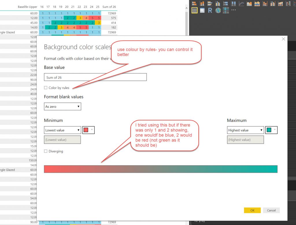
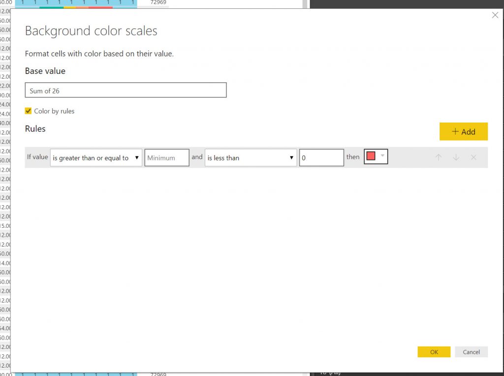
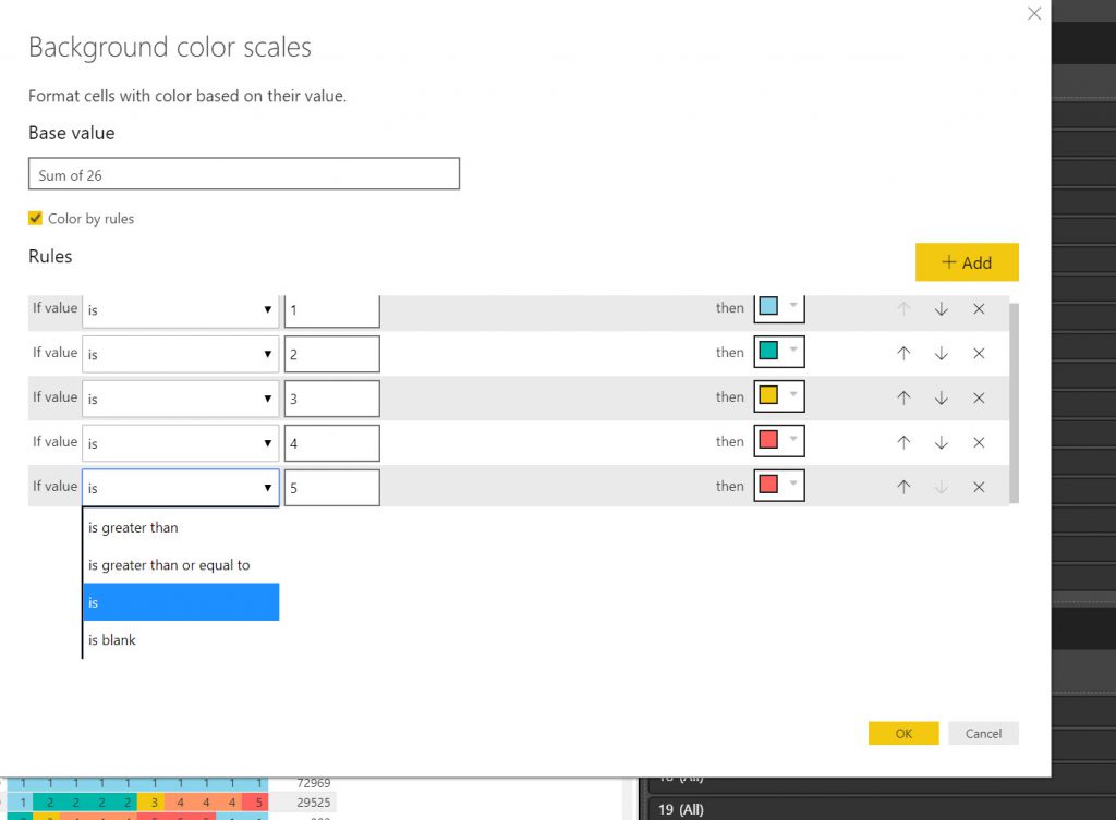
- I found setting up the condition colouring in Power BI very time consuming as you cannot save the conditional formatting settings (seems weird).
I do like the dynamic nature of Power BI. I appreciate there are limits for the Free version and displaying on Web pages & emailing being the 2 methods of sharing in the free setup. The web page takes a noticeable time to load, especially over Wifi.
I also note that Power BI Desktop is slow with 100,000 rows of data. I think for bigger datasets I would consider prototyping using a smaller dataset to explore before I set up a production version.
I really do like in Power BI that you can download the CSV file of the filtered information from the table (and maps?) after slicing the data up. Much better than Tableau Community.
Appendix 1. Altering Data type in SQL Tables
This wasn’t as easy as what I’d thought it would be. You use the alter command on an SQL Query:
use HousingDB
ALTER TABLE [data]
ALTER COLUMN [Lat] float;
That doesn’t look like too big an issue, the only glitch is that for “Alter” query you can only do it on one column at a time, so it is a little tedious when you need to change data types on lots of columns (as in the condition columns from 2016 to 2041).
So maybe I’ll need to think of a better way to setup the tables in SQL. 2 tests to do 1/ Import from Excel and see if Column data type is brought across, 2/ Setup empty table with column data type and then import data.
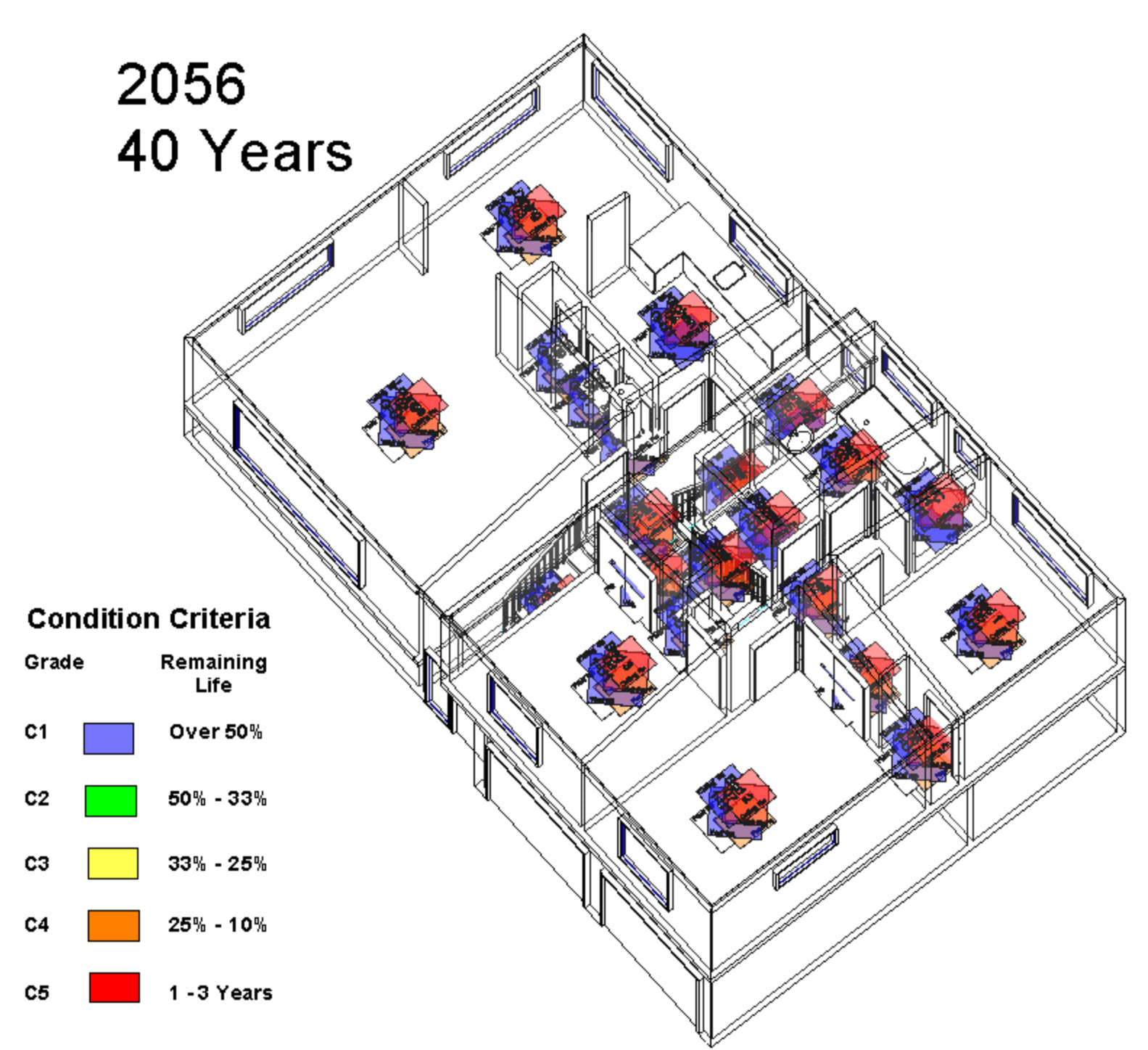
Revit Internal Condition over Time

OpenMAINT 2. Export/Insert Data & Multiple Update procedures & links to 3DPDFs, Plans and Maps