Mapping condition over time Part 2
Interactive exploration of Data
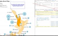
Tableau Public
After the first static processes of expressing Condition over time on a map Part 1 I explored using Tableau Public for creating an interface for users to explore the data.

The House Conditions in Tableau demonstration allows for users to explore the data in a number of ways and modify the data that is presented. Sliding the bar along (top center) shows condition changers over time, also the user can filter the information in a number of ways to isolate a specific component or to study a certain base life component over a spread of buildings in an area to see if there is sufficient grouping to warrant a contract of works for that element.

This image shows Housing property data by postcode- It has been simplified so as not to show addresses.
The Tableau tool allows for a number of filters to be applied to the data to help users explore that data.

Property Data represented, using size to show larger floor areas
The issue I have with Tableau is, the public version requires you to upload your data to their cloud. You then loose control over that data. Also, after filtering the data to get a specific insight, you can only save the original dataset, not the filtered set. The only way to keep the insight is to do a screen capture. Also Tableau needs the data to be quite clean, so that it filters correctly. This requires a lot of pre-processing of the data.But it is a pretty impressive tool to use.
Tools for pre-processing data
The tools for pre-processing that I have been using are Excel, FME and/or KNIME. With Excel you have to build macros that are robust, with FME or KNIME you have to create the Workflow , then try and break them to see that they are robust. What we need to plan for is an automated process to convert the data dynamically from a Server/Database, so that live data can be adapted to be visualized.
After developing the KNIME to TABLEAU process I was asked to see if there was an alternative to Tableau, as software control was quite strict in the organization.
Google Maps visualization
So I looked at adapting the Data to be presented in Google Maps. This required a bit of programming in HTML, CCS & JavaScript as well as using JSON files for data structure. The challenge of programming was interesting , but once you have the code, you can then upload whatever data you want. This
Although Google Maps is a lot more open, it is a little fragile. I had issues of not being able to read files on local drives from different browsers and ended up having to host the geoJSON file on a server. I have since found a website that hosts the geoJSON data to allow it to be read on most browsers Myjson. (Ultimately the files will be hosted on the organizations server, but for testing this process is adequate)
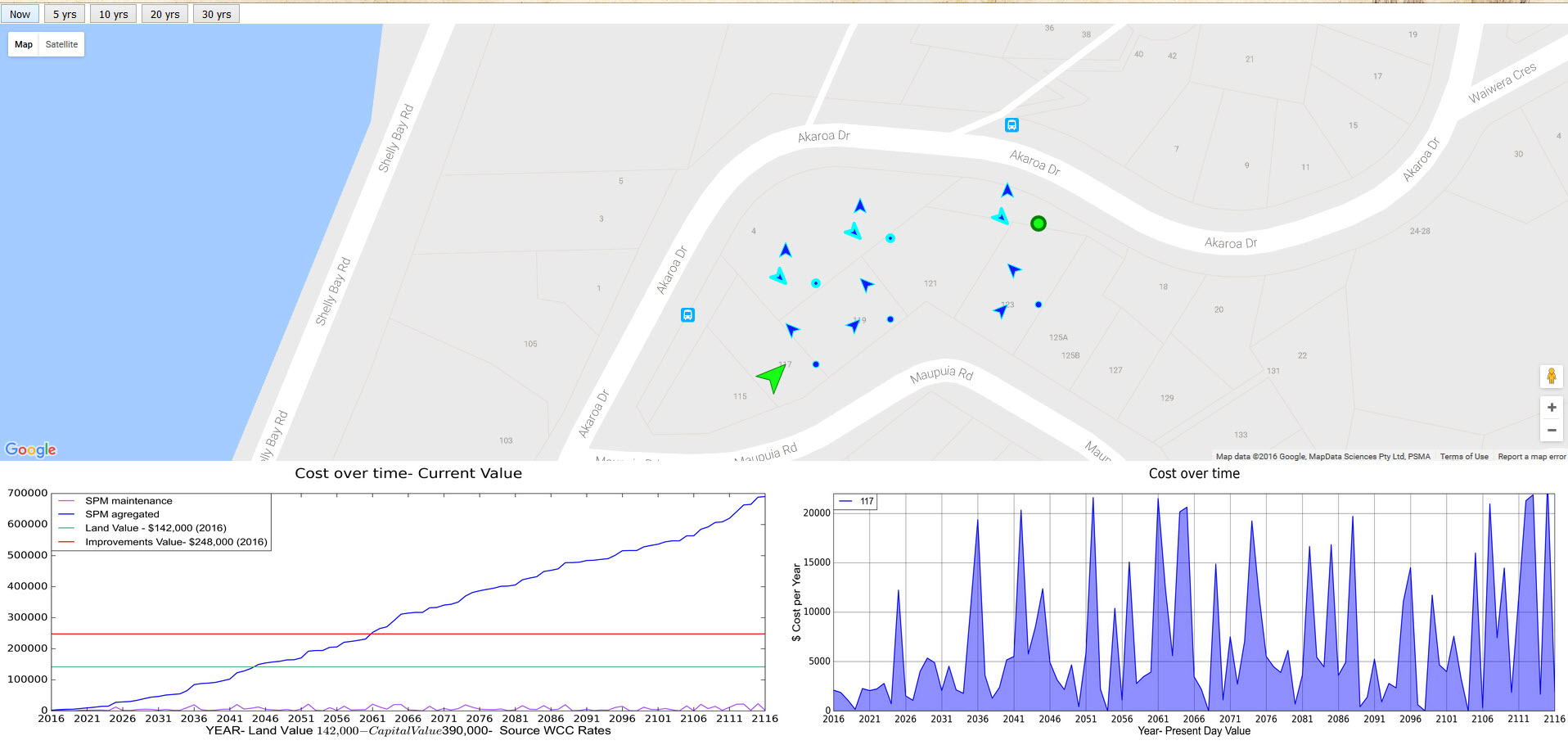


The nice thing about Google maps is that it is in common use, so a useful platform to use.
For the graphs I used FME as this was being rolled out at WCC. I did explore creating graphs with other web tools but found that you still had to manipulate/massage the data to the way you needed it displayed. So the FME/KNIME type processing tools are good for creating a standard workflow, so that once you point it at the data you want, it processes it in a consistent way.
Although these were proof of concept processes I believe that it is a real viable path to explore data. Generally, most people are very visual, so displaying the data in a visual manner is important.
The next part of this exercise would be to then be able to drop out the data in a manner that was useful , after interrogating the graphics.
This work is based on showing external elements and their conditions, but could be extended/filtered to work on internal elements , quantities and finishes and also on services and other aspects of buildings such as Building Warrant of Fitness’s etc
The project would need to be scaled up so that you would be working on a server process to have real time data to study. But all doable. I would be happy to come and play in that playground.
Free WP plugins for Facility Property Management Site Part 2
QGis Madeira Basic conns to Maps/.csv’s/Databases