Mapping condition over time Part 1
Visualization of geographic building elements
Using the same dataset as the Revit internal Condition over Time , I wanted to explore how it could be used geographically to describe the diverse buildings and their locations around the city.
QGIS
One of the first things was to plot the buildings on a map. For that I got the opportunity to play with QGIS. Coming from an Architectural background, it took a little while to get the feel of the tool. I had previously been playing with Google Earth to show our 3D models, but QGIS is a much more exacting tool. I used it to plot geographic locations and scale by unit numbers, so Large dots were large buildings and small dots stand-alone buildings.
Knime for processing Data and Map projection
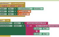
After doing this, I started playing with KNIME. A Business Intelligence Tool.
This was used to simplify the data so that it could be represented in a graphical manner.

This took the coordinates of the building and offset components of the building, here I used different shapes, triangle for roof, square for wall, circle for window & diamond for door. I could then display the condition of those elements at a point in time.
Next I projected them through the years, similar to the Room Condition over time. I also split the elements and the finishes apart, so there are wall substrate and wall finishes and the same for doors. The roof was coloursteel, so pre-finished & the windows data did not have a finish.
The notion of describing the external elements geographically could also extend to describing internal elements.


The filtering of what to look at is further explored in Part 2 of this condition exercise.
We can even display the data with the aerial map background.

This idea is developed further in Part 2.
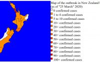
Covid by region NZ -map representation- Part 1
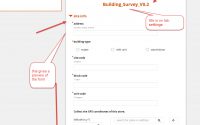
Free Mobile & Web Survey Application for easy data collection using Open Data Kit (ODK)