Revit Presentation techniques-Displacement Views & Perspective Sections
Presentation is a good way to tell a story. You need to add enough interest to draw people in to explore, so you need to make it attractive. Not necessarily tell all the story but accentuate the positive. Images to support narative.
Old days lots of effort for presentation that was not used in main workflow
Personally, I’m a bit anti presentation documentation, as you spend a lot of effort making things pretty, then, when the job is bought you get onto the real work on how to build the building. Starting from Preliminary design, Pen & Paper, setting up a perspective and colouring it and adding superfluous features (such as carefully located planting to conceal unresolved features).
- Speed up the tedious stuff and enjoy designing and documentation more
- Works in all versions of Revit
- Information to PROVE your increased speed
It took a long time to create and then was disregarded when you got onto the Developed & Contract documentation stage. It had its place, and since my training was from the tools through to design it was never a major area of interest to me.
New tools making it easier to add presentation information to clarify , especially colour
As tools have developed, such as CAD and BIM its at the point now where you can use a 3D view to help explain, very quickly, what would take you a few 2D ketches to convey. Also in modelling tools like Revcit, you can start to enhance these views, without a major slowdown or deviation from your main objective of documenting a building, to show ideas/concepts within that documentation phase.
Especially as colour prointers and viewing documentation on Mobile tablets & phones gives you the colour dimension to add to your documentation.
So the new designers are taking these tools as given but I personally have always focussed on buildability and explaining the construction perocess and needs to those who will be building the building, rather than looking at front end presentation, which I find, takes me a lot of time to get into an aesthetically pleasant form that I’m happy with. I find I fiddle a lot without an efficient workflow.
Also , I do not do it frequently enough to develop a stylised workflow to
My current project requires some front end presentation
So, I need to do some front end presentation information that is helpful in conveying ideas to other, non technical people and also convey that things have been thought through.
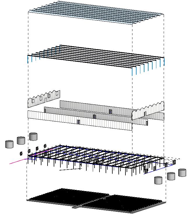
Revit Displacement Views
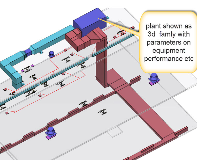
I do like the ideas of these, its like having a toy house and lifting the roof off and looking inside. You can displace elements and/or categories in Revit away from their original location so 1/ You can look inside/behind that element to show what is behind it & 2/ You can show that that element is necessary for the complete composition of the building.
The things I like about Displacement Views are:
- It only affects the view that you’ve created. So the original model is as it originally was.
- Great for moving an element aside to show something behind that would usually be hidden or a relationship between different elements/features that you can now show
- You can Reset elements/categoriesd back to their original position if your initial move of them is too messy.
- You can rotate the view around and re-adjust elements for different perspectives, also just duplicate a view if you want to show other things from a different viewpoint.
- You can then add enhancements to ther view such as Ambient Shadow and colour to add extra depth to the image.
- You can have 2 or more views overlaid to show a/ The floor plan with partial height walls using section box and b/ displacement view above showing say deconstruction categories such as structure and solid walls. This then shows floor plan logic ans well as how the fabric/services etc fit around it.
Here are a couple of videos that got me up and running on this:
The first one shows that you can move elements in X,Y & Z axes, so do not need to just use the Z axis if another direction can be used too.
I’ve the Balkan Architect presentation video below, I like his tutorials.
This one is pretty basic as I think he want people to enrol in his propper course , but it gets the point across,
The one below is not displacement cview but shows a couple of other techniques such as making elements semi transparent so you can see behind and some of the finishes. Not that happy about the wall to 150mm as this will affect other views.
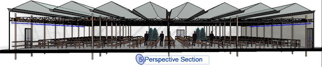
Revit Perspective Sections
This was a great idea, Perspective Sections. They convey a lot more information.
I initially got the idea from REVIT PURE in the article 8 Tips To Create Beautiful Drawings In Revit. They were doing some enhancing of a perspectiove section and I wondered how they were doing it. So I found the Balkan Architects video on his method below.
In the Graphics Display option I used Consistent colour and it looks really good. I did not mess around with the material categories and did do some adjustment to ambient lights/sunlight & shadows (in the lighting part)
The video below is great, up until he starts making images to send out to Photoshop. So I only wnt as far as setting up the view and then enhancing it by using VV and cut pattern for edges of slab and walls (over ride and turn to black).
I did have an issue on scaling the perspective view. It looked really good but was ver small and so would not print well. Then I found this article on Adjusting the Scale of a Camera View. This was a really helpful article.I liked the finished product I stuck it on the cover and the section drawings.
View Titles, cross referencing and notes & COLOUR
This is something that I’m exploring at the moment. A lot of the OOTB (Out of the Box) Revit System families are pretty boring. So I go in search for an alternative. So far I’m exploring and have not structured them in any way.
Sheet notes using schedules & number bubbles
As I’m working on A3 print size I want to be able to quickly see things and follow references. If you put lots of text on drawings it starts to get very busy very quickly. I personally like explaining why I’m doing something in a note, such as screw fix roofing to purlins below TO STOP UPLIFT in wind. So, do a thing, and this is why. I get a lot of builders saying, yes, I saw you wanted bolts but we thought we could use nails instead, but when you explain why you needed the bolts then they say, ah, yes, I see what you need them for. This is a diatribe for another time. Needless to say, my notes can be a bit verbose, and on Small scale drawings the business can cause confusion. So I’ve been going to coloured bubbles with a schedule of notes. A little more tedious.
I came across this video by Revit Pure and have been trying it out. The actual bubble I have created has a coloured region behind the number, so I can have different coloured notes for different note types, such as Construction notes (orange), security Notes (green) etc…:
I do find it takes longer to organise the notes and set them up and you have to adjust Schedule size to make sure it fits on the sheet OK, but I do find it makes me be more specific with the notes for consistency, and instead of repeating the note multiople times on the same sheet, you just have a number repeated and you filter the schedule for only a single instance to show. I’m getting used to it and its making the drawings less busy.
Viewport Titles
I do find the OOTB titles boring, and irritating if you have the line. As its a system family I have, in the past, left it alone. It has been too hastly to bother with. But it does bug me on smaller drawing sheets trying to find agood place to put the title and also making it clear.
I’m a strong proponent for the use of less drawing sheets. I would rather have a drawing set of 50 drawings rather than 100. So if I end up with busier drawings, that is the downside. I find leafing through lots and lots of sheets (or files) to find the one section per drawing, that looks so neat and tity , sitting in the middle of a blank sheet with no relational information around it, a waste of time. I dont want to look on 4 sheets for 4 elevations, stick them all on one sheet. If you need to go into more depth, then break out into different sheets for a specific area.
So siting and finding view titles can be an issue. They are sometimes too big, so they’ll stand out from the rest of the information on the sheet, and so its easy to find the specific view you are looking for. Not so good on smaller sized drawings as this text/information can take up a lot of space.
So I’m thinking, if we use a colour/shape we can make it easier to identify and make the text smaller so that it takes up less space. So I’m exploring using different shapes/colours to give the visual que. See the title on the image below, I’ve used an Oval & a background colour. The title size is still the same as the standard Revit OOTB title but I intend to make it smaller.
I don’t think the colour stands out enough, I will explore others. Nor the shape, maybe a STAR shape or polygon of some type.
Also, I’ve noticed recently there does not seem to be back referencing as much, and I want to see if I can add this to the information.
So, for this , you need to duplicate a Viewport family to a new name
Then go into Library- Annotations-Symbols– and find View Title Family and open Family in Revit . Save as a different file name and save as a new family. Dont forget to LOAD into the Project you are using.
video about wall system families: